Social Network Fragments- Implementation
[index][background][theory][implementation][presentations][contact]
[danah boyd][jeff
potter]
---
---
In this section, i will talk about the implementation of Social Network Fragments as two separate phases.
The first phase, considered the layout phase, was primarily the modification of Jeff's BuddyGraph work in order to suit the needs of visualizing email networks in order to reveal the structural holes in the networks.
The second phase, known as the visualization phase, focused on constructing an interactive visualization tool for users to explore the social data that emerged from their networks.
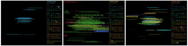
Much of the implementation details for Social Network Fragments can be found by reading the construction section of Chapter 7 in danah's thesis. In this section, danah details the culmination of all of the implementation, showing example images from the visualization section. In addition to these images, the interested viewer can explore early images from the layout phase.
---
Layout Phase. [early images]
First, the user must provide data about their email habits. In particular, the user must provide four data files in addition to their email spools:
- A list of all contexts with which the subject can classify their associates, associated with particular colors.
- A list of all email addresses that represent the subject (and the context in which the subject uses that address).
- A list of all email addresses that represent the same people (and potentially the context in which the subject knows the individual).
- A list of all listservs to which the subject is subscribed (and the context in which the subject is subscribed).
This data is used to compute the strength of relationship between all associates based on the relationship values, described in Chapter 7 of danah's thesis.
After precomputing the weight strength between each coupling of people in the subject's dataset, a spring system is utilized to systematically position the nodes in the complex n-dimensional graph. The settling position is based on best fit, where clusters are meaningful but nearby nodes are not necessarily closely related.
The result is a layout that provides the user with a visual image of one's network. Colors help provide clarity by allowing the user to see which context the subject knows each individual.
---
Visualization Phase. [thesis images]
Using the layout system as a foundation, we built a visualization that allows the user to more actively interact with the data. Rather than simply seeing the completed image, the image is broken down in time slices, where what is presented is a series of images over time, allowing the user to more accurately see how connections in their network emerge.
A history panel allows the user to navigate the complete time span. Zooming into the data allows the user to get a more detailed view of the various clusters, while individually selecting various individuals in the network allows the viewer to get a more detailed picture of the relationship between the subject and the individual over time. This interactive visualization also allows the user to understand the evolving connections between the subject and the different individuals in the network.
A more complete discussion of the visualization phase, the history panel and the implementation problems that emerged can be found in Chapter 7.
---
These phases are more clearly articulated in Chapter 7 of danah's thesis and by viewing the different examples.