Inhabiting the virtual city
Judith S. Donath
This chapter is about inhabiting the virtual city. The concepts developed in earlier sections - the role of visual representations and the creation of a cultural context in an information space - are brought together in a discussion of a multi-scale environment.Imagine you are at a party, in the real world. You look around the room, seeing how the guests have gathered in various conversational groups, some lively and loud, others privately intimate discussions. You see who is a center of attention, who is wandering about restlessly. An acquaintance notices you and sits down to talk for a bit. While conversing, you notice little things - perhaps the style of his shirt or a slight Southern accent. Nothing remarkable, though in the course of the conversation your perception of this acquaintance grows deeper.
In real life, one moves seamlessly from taking in the patterns of a large group, to observing an individual close up, to participating in a conversation. Understanding of an individual is helped by one's knowledge of the setting; comprehension of the setting deepens as one learn more about its inhabitants.
Filmmakers are aware of the importance of providing views of their subject from various perspective. The long shot tells about the environment and its social patterns: is it crowded or empty, a hangout for college students or a businessman's establishment? The medium shot follows the conversation, listening to what is being said and watching reactions of the participants. The close-up shows the details of clothing style and facial expression, the features of self-presentation both deliberate and subconscious.
In the on-line world, these views are too often isolated.
The focus of this section is the A Day in the Life of Cyberspace web site (ATG and Media Lab 1995) [28]. It incorporates, in a simple way, several features discussed in previous sections. It provides for large scale visualizations of the community of attendees (the long shot), it provides the means for interpersonal communication (the medium shot), and it introduces home pages that evolve through actions (the close up). Its structure embodies the concept of seamlessly providing views of the inhabitants from various perspectives.
A Day in the Life of Cyberspace was designed to be an on-line festival - a virtual event that people from all over the world could attend and participate in. The goal was to encourage people to think about how cyberspace is developing and its impact on their own lives and to send in writings and pictures about their experience with this new world. With these contributions we would create a ``Portrait of Cyberspace'' - a global snapshot of the on-line world, circa autumn of 1995. The challenge was a) to get people to come to the site; b) to make it intriguing and enjoyable enough so that they would not only explore it, but actively participate in it; and c) to create an atmosphere that fostered thoughtful contributions.The event was structured as a ten day countdown, in order to build interest and word of mouth referrals. The countdown gave people a chance to see the site, participate in it and to link to it. Each day had a different theme. The site was cumulative: the first days theme was ``Privacy'' and that was the only material available. The second day was ``Expression'' and one could visit both the new area and the Privacy area. The site thus grew every day and people were encouraged to return daily to see what was new. The tenth day was a summary of the previous days, including survey results, live feeds from the Lab, and the opening of the Portraits in Cyberspace exhibit.
The nine countdown days all shared a common structure. There was a daily discussion (``Expound''), a survey (``Reveal''), and a short summary piece filled with links to the rest of the Web (``Review''). In addition, one could wander among the internal home-pages (called ``Capsules'') of the other people on the site.
7.1.1 Expound: rated discussion
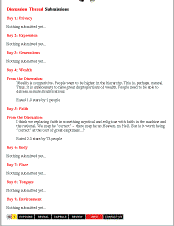
Each Expound section began with a short essay about the day's topic followed by the discussion section. Here you would see a set of three user comments on the topic. Each one could be rated on a scale of 1 (``low quality or unoriginal'') to 5 (``a real gem''). Next to each comment was its current rating and how many people had rated it so far. You could rate the visible comments or press a button to see a new set. The algorithm for selecting comments to show gave precedence to highly rated comments and to new ones with few ratings. The low-rated ones would slowly disappear - but not so quickly that a couple of early negatives would consign a remark to oblivion.The author's name accompanied each comment and was a link to his or her capsule page. Any comments one had contributed showed up on this page - the process of taking part in the discussions thus was part of what created one's own portrait in this site. At the bottom of the Expound page was a form for contributing your own remarks (with the fact that this contribution would be part of your capsule page prominently noted).
We decided to experiment with a rated discussion model instead of the usual threaded discussion for several reasons. One of our goals was to gather people's opinions and reactions as part of a ``Portrait of the Net, 1995''. Thus, we wanted the comments to be stand-alone remarks, whereas letters in a threaded discussion are often too heavily interwoven with the ongoing conversation to stand on their own. Similarly, for the comments to be included in the capsule pages they needed to be readable as independent remarks. Furthermore, we wanted to encourage people to write something outstanding (or coherent, at least). Too often, threaded discussions and on-line chats veer off-topic or devolve into nonsense and name-calling. The rated discussion seems to have succeeded in getting people to try to write something that others would rate highly - compared to many Usenet letters, and certainly to on-line chats, the statements in the Expound section are lucid, well-written, and often thought provoking.
7.1.2 Reveal: surveys and visualizations
The Reveal section consisted of a series of mini-surveys, each linked to the day's topic. They were designed to be short, simple and entertaining: an easy way to participate in the site. Most of them were multiple choice questions, where you checked applicable answers. On ``Expression'' day, for instance, we asked people what activities they participated in on the Net - build home pages, chat, access databases, send email, etc. On ``Faith'' day we asked about adherence to various belief systems, both religious and nontraditional. Part of the ``Place'' day survey asked participants to point out where you are on a map of the world. On ``Body'' day, we included a ``physical fitness'' test - a mouse-clicking race.One's answers to the survey, like the contributions to the discussions, showed up on one's capsule page, but in an abstracted, graphical form. The idea was to provide some feedback without generating misleading pseudo-scientific results. The graphic also served to decorate the capsule pages - to make those of the active participants colorful and compelling.
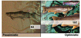
On the 10th we featured visualizations of how everyone had answered the surveys. For the Place survey, for example, we showed the world map with a dot marking the physical location of each participant. One could click on any spot on the map and be taken the capsule page of someone who was at or near that location. For the Environment survey, we showed the continuum from ``pessimistic'' to ``optimistic'' - clicking on a spot in the graph took you to someone who fell in that region
The results of the Environment survey. Clicking on any region of this image brings you to the capsule of someone whose views were in that part of the pessimism-optimism range. For example, clicking where the label a is brought up the capsule of rmarks, from Michigan. On environment, he said While more people seem to be more aware of envi ronmental issues and prob lems, few seem willing to make lifestyle changes that would really make any difference. The power is still in the hands of corpo rate America and if care for the environment is not put ting cash in their pockets, then it is not their top prior ity.Clicking on spot b brought up typhoto. His comment was:Any technological advancement that makes this world a little smaller and brings people from all corners of the globe together in the same place is a great step towards peace among nations." From his capsule, one could go to his home page - which revels in the wonders of enhanced Netscape features and VRML.These visualizations were more simplistic than we liked, due both to the limitations of the Web and the small amount of data that could be gathered in the course of such an event. An interactive visualization, like Visual Who, with which the users could explore the community space would have been preferred, but was not possible within the existing Web environment. Perhaps the most missed feature was the ability to find a particular user in the data: you could click on a dot and find out who it was, but you could not request that a specific person be highlighted.
7.1.3 Capsules & web-o-grams: persona & presence>
Wandering the web is usually a solitary experience - one has little sense of the presence of others. The 1010 site had a number of features that made visiting it a far more sociable experience.You entered the site by signing in - your real name was not required, but you needed to provide an identifying name and password. A home page, called your ``Capsule'', was created for each participant. If you chose to, you could include your real name, email address, home page, or other text and pictures in this capsule. And, as described above, your contributions to the discussion and your answers to the surveys were also recorded in the capsule. Ordinary home pages are designed once and then updated infrequently. These capsule pages had the interesting characteristic that they were updated continuously through your participation in the site - they are not the wholly self-conscious creations that home-pages usually are.
You could get a sense of the ``crowd'' on the page you were viewing: the top of each page listed the recent visitors to the page and told you how many people had visited the page in the last few minutes. It was thus possible (and not uncommon) to ``run in'' to people you knew - either from the on-site discussions or elsewhere.
Any mention of someone's name was a link to their capsule. If you saw a comment you thought intriguing, or were just curious about the other people on the same page as you, you could click on the name and see what they had been saying.
When visiting someone's capsule you could send them a message. These messages, called ``web-o-grams'', were a simple messaging system integrated with the site. Web-o-gram's appeared as notes on the top of the recipient's page. Each web-o-gram automatically came with a link to the sender.
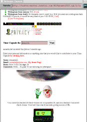
A Capsule. At the top are are some web-o- grams (visible only to the recipient) and a form for sending them, followed by optional personal data such as home page. The pictures are tokens from the surveys. The text at the bottom is entries from the Expound section. |
There is a deep-seated belief that one's actions and character are written, unwittingly, on one's face. Even a still photograph - a moment abstracted out of time - can seem to yield clues about the subject's character. Whether or not there is an objective truth to this - and certainly many of its methods, such as phrenology, have been discounted - it remains a powerful social force. Psychological studies have shown that people read numerous character traits into facial features (Synnott 1993). On-line, seeing a photograph of someone can vastly alter one's impression of them.The home pages (capsules) that were automatically created in the A Day in the Life of Cyberspace site were much simpler and more constrained than ordinary Web home pages. Yet they had one very interesting feature: they were built as a by-product of ones actions, rather than as a deliberate design initiative.
The Picture of Dorian Gray "Then he drew the screen aside and saw himself face to face. It was perfectly true. The portrait had altered." - Oscar Wilde
There's no art to find the mind's construction in the face.- Shakespeare, Macbeth
The idea of a virtual self-portrait that evolves over time is quite interesting - and controversial. The Day in the Life pages were a first stab at the problem and they were very simplistic. Yet they showed that even just recording one's actions in a suitable environment could easily make for compelling portrayals; they are less self-conscious than ordinary home pages - expression is given off, more than given. Furthermore, such self-portraits could grow to be quite complex, becoming items of great value to their subject. As we discussed earlier, the lack of commitment to one's virtual self was a basic problem in the on-line world. A self that carries history, that cannot be easily reproduced or substituted for, is a grounding mechanism, making the subject more aware of the consequences of actions.
Indeed, before long, one may expect that instead of an artist's profile portrait the future will preserve only complete actuarial files, stored in some omniscient computer, ready to spew forth a different kind of personal profile, beginning with one's Social Security number. Then and only then, will portraiture as a distinctive genre of art disappear. (
Brilliant 1991)
Will portraiture disappear? Or will it be transformed? Gombrich described the idealized role of the portrait artist as the ``Neo-Platonic idea of the genius whose eyes can penetrate through the veil of mere appearances and reveal the truth''.
(Gombrich 1972) The on-line world, with its central and problematic concern with identity, will be the source of immense invention and creativity in portraiture. There will be other forms beside painted canvas that can ``reveal the truth'' - portraits that interact, that have behaviors, portraits that exist within a communicative context.