Before designing ways to transferring text-based conversations into the graphical domain it is useful to outline a taxonomy of these discourses.
6.1.1 Types of conversational interfaces
On-line conversations [24] are either real-time (synchronous) or stored (asynchronous). In a real-time conversation, such as a chat room or MUD, one connects to a server which distributes, in real-time, the comments typed by any connected participant to the screens of all the others. Real-time conversations correspond more closely to oral speech: participants are temporally, if not spatially, co-present; utterances tend to be short, informal and highly contextualized within the surrounding discourse; and the conversation is ephemeral [25]. Stored conversations, such as mailing lists and newsgroups, are more like traditional written discourse: messages are generally longer and more formal, the discussion participants read the material on their own time, and the messages are available for perusal for at least several days, if not indefinitely.
Real-time conversations are generally more social than their asynchronous counterparts. Although substantive issues can be discussed on MUDs (
Bruckman 95) the participants in MUDs and chat-spaces tend primarily concerned with establishing their persona, interacting with others, observing the group dynamics, and advancing their own status in the community. Conversely, while there is a strong social subtext to many Usenet exchanges, the contributors to newsgroups and mailing lists are, at least ostensibly, intent on exchanging ideas and information, and each posting is expected to make some contribution to the discussion. Logging into a real-time conversation and announcing ``Hi! Here I am'' is good manners; posting a Usenet letter with same content is not.
Nearly all of the avatar systems in current development (or in fiction for that matter) are graphical versions of real-time conversation systems
(Rossney 1996). This is not surprising, since many social cues that are needed in a real-time conversation - such as emotional expressions, indications of attention, turn-taking signals, and awareness of presence - are problematic in a purely text-based world. Many of the distinctive vocabularies and discourse patterns (smileys, emote commands, etc.) that have evolved in these environments are attempts, given the very limited communicative channel, to introduce expression and other non-textual components of real-world speech
(Cherny 1995). Graphical interfaces provide a promising new medium for conveying this information.
Thus, in this chapter I will concentrate on graphical interfaces for real-time conversations. However, it is worth keeping in mind that there are other conversational modes in the virtual city - modes which are better suited for some types of discussion and which may also benefit from a visual interface.
Even within the category of real-time conversations there are wide variation, both in the technical underpinnings and the communicative culture. Chatting (typing messages back and forth to other participants) is the main and often sole activity in sites such as Internet Relay Chat (IRC) and the chat rooms of America On-Line (AOL) and other commercial services. Chatting is an important activity on MUDs, but it is not the only one. Game playing on adventure MUDs and programming complex character and environmental behaviors on social MUDs are also an important part of MUD culture. Graphical environments can follow either model; the creative possibilities of a programmable and visible environment are endless.
6.1.2 Avatar systems
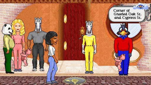
Avatar systems have recently become very popular (or rather, building them has; it remains to be seen how popular they in use). Avatar worlds, like MUDs, are shared virtual spaces: a central system keeps track of the state of the ``world'', including who is present and what they are doing. Each user controls his own avatar - moving it around, making it speak - and these actions are seen by the other users in the space. Today (September 1996) there are numerous avatar worlds in varying stages of development [26]. Some are two-dimensional spaces: characters exist in a flat plane and one sees one's own avatar the same way that others do, from a third person perspective. Others are three-dimensional spaces: characters are free to move in all directions and one sees only what is in front of one's virtual eyes, from a first person perspective. In some worlds, the avatars are static images, stiff and expressionless, while in others they are endowed with a varied repetoire of gestures and actions.

|
| A frame from an avatar system
called WorldsAway (
Fujitsu 1996)
|
Are visible avatars more expressive than their text-based counterparts? Is identity conveyed better through images or verbal descriptions? The creators of graphical systems believe their worlds to be a great improvement over the textual environment. Yet the matter is not so simple. Proponents of text based worlds argue that words are more expressive, that richer, more detailed and imaginative descriptions can be made verbally, and that the graphical environments are unimaginative - all the creativity is done for you.
Often in design, the best answer to questions of the form ``Which is better, A or B?'' is ``Yes.'' Much depends on the circumstances - the goals of the users, the particular implementations. In this chapter I will examine a number of the perceptual and design issues involved in making a graphical conversation interface; in particular, the advantages and difficulties of visually representing the human users. The starting point for the discussion will be a system I built called The Illustrated Conversation.
(For more about the sociology and linguistics of on-line conversational systems see:
Sproull and Kiesler 1991 on discussion lists;
Sproull and Faraj 1993,
Kollock and Smith 1995 and
Donath n.d. on newsgroups;
Reid 1991 on IRC;
Reid 1994 for a comparison of social vs. adventure MUDs;
Bruckman 95,
Curtis 1992,
Cherny 1995,
Reid 1994,
Young n.d.,
Herring 1994, and
Young n.d. on MUDs. For accounts of existing graphical systems
Rossney 1996 provides an overview of the larger systems as of Spring 1996;
Morningstar and Farmer 1990 and
Toyoshima 1994 discuss their forerunner, Habitat).
The Illustrated Conversation was designed and built in 1992-93. (A full project description is in
Donath 1995a.) It was a response to interfaces that were being created for CSCW projects in which participants were represented by rows or grids of heads staring straight out of the screen. I was interested in creating a space in which the interactions among the participants, especially the changes in their attention, would be visualized. Seeing someone looking straight at you is a powerful social cue, and I wanted to use it as such, rather than have it simply be the default pose.
First I will describe the main features of the system. I will then discuss two of the features - gaze and personalized space - in depth. Representing attention via gaze can be thought of as a subset of the larger question of how to represent expression in a visual environment. Understanding the issues involved in indicating the desired gaze direction and representing it on the screen provides a foundation for addressing the more complex issues involved in representing expressions. Similarly, studying the issues involved in deciding who controls an avatar's location on the screen provides a basis for looking at the more general questions of control within a shared virtual space.
6.2.1 Project Description
The Illustrated Conversation created a simple movie of an unfilmable event, a meeting among several widely separated people. The interface provided a shared virtual space for the conversation and each participant had a first person viewpoint from which to see who else was present and who was communicating with whom. The main design points of this project were
The first two points will be the focus of the more general design discussion that follows. I will briefly introduce all the features here, for they each influenced the design of the interface.
6.2.1.1 Gaze
As participants sent messages to each other, their heads turned to face the object of their attention. The interface was simple. One could send a personal message to someone by clicking on their image. Only that person saw the message contents, but on all screens the sender was seen turning to face the recipient. Since the interface was in the first person, on the recipient's screen the image of the sender faced directly out, creating the appearance of eye contact. One could also send a broadcast message, in which case everyone got the message - and all participants saw the sender looking straight at them.

|

|
|
The Illustrated Conversation:
Two views of the same discussion.
The top picture shows Arthur's
point of view. He is conversing
with Lindsey, whose point of view
is shown at bottom. Although they
each have arranged the images of
the other participants differently,
the relationship among them - who
is facing whom - is the same in
both screen, e.g. both show Martin
and John also conversing.
|
6.2.1.2 Personalized space
One could arrange the layout of faces on your screen in any way preferred. The shared space of The Illustrated Conversation was limited to the relationships between the images - whom was each one facing. The geometry of the space - who was where - could be set by each user. The idea was that in a workspace interface the important features were to see who was present, who was part of the group and where the current activity was. People with whom one worked closely could be moved to the front, others to the periphery.
6.2.1.3 Presence
In a text-only discussion only the speaker is apparent: the listeners are invisible. In The Illustrated Conversation all participants are visible. It showed two levels of presence. One could be fully present, meaning logged in and participating in the discussion; or one could be absent from the immediate discussion, but still part of the group. A full color photograph represented people who were present; a monochromatic drawing was used as a placeholder for absent participants. The idea was that people could log the discussion sessions they were unable to attend; the drawing made it clear that they were part of the audience, but not actively participating.
People are involved in many on-line discussions, often simultaneously. The
Illustrated Conversation was designed to be an awareness tool. Many windows, each representing a different discussion, could be on a single screen (the window were scalable). If not actively involved in a particular conversation, one could scale down the window and appear as a ``lurker'' - a non-active participant. If the activity on one seemed intriguing, the window could be scaled back to full-size and one would return as an active participant.
6.2.1.4 Video
One of our goals had been to integrate video into spatial interface. Desktop videoconferencing was becoming a reality, but here the unfortunate faces-in-a-row interface was especially hard to avoid: a coherent space needs to be made from a single camera view; with multiple cameras (one for each participant) the best that can be hoped for is that all participants look straight ahead, for if they look off camera, they are clearly observing something in another, separate space. In The Illustrated Conversation video links could be set up; when someone was addressing you (and such a hookup was available) the stored face (which in those circumstances would be looking at you) was replaced with a video feed of the speaker.
|

|
|
Raphael, Pope Leo X with two
cardinals (detail).
Painters use gaze to show the
relationships between people in a
group portrait and to indicate
something of the nature of the
represented individuals.
|
6.2.2 Gaze and the re-creation of expression
Gaze is a very intuitive way to represent attention.
Human eyes are unique in that they have whites in order to signal gaze direction to their fellow humans. This is vital to follow the shifting attention of our social companions (
Landau 1989)
Using gaze in the interface was a simple and easy to understand way to convey useful information. It required no additional effort from the user. And, it resulted in an interface that, although it was rather starkly abstract, had some of the dynamics of a real-world conversation.
Displaying gaze indicates what part of a scene has attracted someone's attention. Ishii and Kobayashi
(Ishii and Kobayashi 1992) termed this gaze awareness; their observations of people working with a shared drawing space led them to conclude that gaze awareness was the key feature in such collaborations.
6.2.2.1 Gaze input
In The Illustrated Conversation gaze was used only to indicate speaker attention. It required no additional effort by the user because message sending already required indicating a recipient. In general, when the user is actively engaged, whether it is sending a message to someone or interacting with an object, showing attention via gaze can be done without added effort on the part of the user. The difficulty is with showing passive attention, such as reading a message or observing some activity; here, one must either capture the user's real world eye movements or require that the user do something to indicate attention.
One approach to using gaze to indicate attention in a shared space is to use video, finding a way to integrate images of the participants in such a way that the geometry of the space is preserved. An example of this is the shared drawing space mentioned about. Ishii and Kobayashii created a very intuitive collaborative environment - but it is limited to two participating sites
(Ishii and Kobayashi 1992). Video is not suited for general use in a multiple person shared environment because of the impossibility of reconciling the multiple camera views into one coherent space.
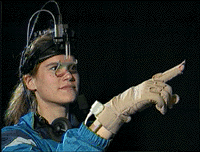
For the sort of environment we are concerned with here - a synthetic space with multiple users - eyetracking is perhaps the ultimate solution
(Bolt 1984), especially because it can reproduce the complexity of gaze patterns:
In a normal two-person conversation eye behavior is predictable. As speakers, we begin a conversation by establishing mutual gaze with the listener. Then we break away. Then we look again t o check for the listener's feedback. As we engage in conversation, we use our eyes to monitor our partner's interest, understanding, and acceptance of our words. (
Landau 1989)
Yet eye-tracking requires cumbersome equipment. And it can be too literal. The shared screen space is a limited window, from which the user's attention continuously wanders. Ideally, the graphical interface should show a rhythm of gaze roughly corresponding to our expectations of expressive behavior. Whether the problem is too little input (as with the mouse) or too much (as with an eye-tracker), for a representation to appear ``natural'' it will need to filter and augment the data. Cassell and her colleagues
(Cassell et al 1994) describe a system which generates gaze (and other expressions) based on dialog; such a system could be potentially used in conjunction with live input to modify and smooth data from the participants' actions.
6.2.2.2 Gaze output
Gathering the input to indicate gaze is only half the problem; the output image must also be generated. The system must be capable of showing each face looking in every possible direction. This can be done programmatically - by having a system that can generate the necessary image as needed - or by the more brute-force approach of creating a set of frames in advance showing a reasonable set of the desired gazes. For The Illustrated Conversation I did the latter, first with seven and later with twenty-eight frames. For photographic images this approach has several advantages: it is relatively easy to make the images, the frames clearly correspond to a particular gaze direction, and one avoids the often strangely disturbing look that comes when photographic images are modified; just as we are very acute judges of where a person is looking, we are also very sensitive to mis-renderings of eyes and expressions. However, one is subsequently limited by the frames shot: if there is no frame that comes reasonably close to showing the subject looking in a desired direction, it cannot be shown.
A synthetic approach, computationally rendering the eyes and/or the head to appear to be looking in any needed direction is more extensible (
Agawa et al 1990;
Choi et al 1994;
Morishima et al 1990;
Waters and Terzopoulos 1992). However, today's techniques often still result in images that appear distorted. Furthermore, the client programs must all be able to synthesize the needed faces, Thus, even for cartoon images, if the rendering process is complex it may still be more practical to render a set of frames in advance than to expect the clients to be able to create the needed face on demand.

|

|
| Image data sets from The
Illustrated Conversation.
The set of seven (top) was quite
compact, but limited the layout to
a single horizontal plane. Adding
a range of vertical gazes (above)
made a greater range of spatial
layouts possible.
|
6.2.2.3 From gaze to expression
Gaze is but one part of the general problem of indicating expression. From the discussion above, it is clear that implementing even this relatively simple and straightforward feature can be a complex design issue. Indicating emotional expression with an avatar is a far more difficult problem. Gaze, at least in its role as an indicator of attention, is relatively unambiguous. An interface in which one clicks on an object and one's avatar turns to face it, while perhaps not the most seamless of interactions, does capture the desired activity. But what about, say, a smile? How does one indicate that it is time for the avatar to smile? By typing the word? Clicking on a graphic? Having a video capture system that sees you smile and replicates your expression on screen? Or does the system interpret the conversation and intersperse smiles at appropriate moments? Rendering the right smile is also complex. There are many smiles (
Ekman 1982;
Hauser 1996) and even slight muscular difference in the way the eyes participate or the speed at which the smile appears and disappears can greatly change the nature of the expression. Eisner's illustration shows how facial expressions can transform the words they accompany. If used well, the communication channel is greatly enriched; if poorly done, the resulting exchanges will be misinterpreted and poorly understood.
6.2.3 Personalization and control in a shared space
Who determines the appearance of my screen when it represents other people? It seems reasonable that I should be able to resize a window to accommodate other work I am doing - what about resizing participants in a conversation to see only those I care about? Who should determine what I am wearing - me or the person looking at me? In virtual environments these questions are often determined by the system design: one can create environments in which the user has full control, none at all, or a negotiated middle ground.
The appearance of a shared virtual space is always a compromise between the wishes of the viewer, the other participants in the space, and the designer of the environment. Does the environment limit how big (or strange) my avatar can be? Am I in full control of my avatar - or are you able to change my appearance or behavior? Here I will approach these issues by looking at the seemingly simple question: who controls where my avatar stands?
In The Illustrated Conversation, one was the master of the layout on one's own screen, controlling where all the avatars stood. This was done so that the presence and activities of the people with whom one worked most closely could be easily emphasized and seen. The design reflected our initial conception of the project primarily as an awareness tool.
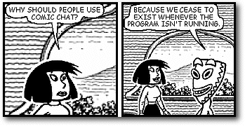
In other systems, the designers determine where one stands. Microsoft's Comic Chat
(Microsoft 1996) is a shared space made to look like a comic strip. As the user, you control what you say, but the system automatically places your character and makes it gesture. The intent, says the site blurb, is for the screen to ``aesthetically represent the conversation''.
 |
| Frames from Comic Chat.
This program automatically
generates default gestures and
expressions; it also controls the
layout of the frame.
|
Other systems let each user control his or her own avatar. In retrospect, I think there are compelling arguments for this approach. Having the viewers determine the location of all avatars in their personal views (as in The Illustrated
Conversation) or turning control over to the system itself (as in Comic Chat) eliminates a very rich and useful means of communication. Moving one's avatar around, to join a group or walk away from a discussion, can be a very expressive act. In a 3D, first-person world (you see the environment from your avatar's perspective) you are motivated to move about in order to center an item of interest on the screen or to move to another section of a larger environment. Others see your avatar's movements, which are indications of your interest and attention. In a third-person world (you see all avatars, but control only your own) adjusting location seems to be a more consciously expressive act, as participants place their avatars in relative to the others on the screen [27]. For instance, while observing several sessions in an 2D environment called World Fiction
(ATG 1996), I noticed that people moved their avatars about on the screen in a manner similar to people standing around talking: the participants tended to distribute themselves around the screen, making room for new arrivals and filling in spaces when someone left. They would also often move a bit before speaking - the development, perhaps, of a turn-taking cue (
Goffman 1979b;
Saville-Troike 1982).
Greater control over one's representation brings greater expressiveness - and less individual control over the scene on one's screen. By giving each user control over his own avatar's location, the resulting views may not be as ``aesthetically'' well designed as in Comic Chat or as personalized to the viewer's concerns as in The Illustrated Conversation. In the case of location, the advantages of greater expressiveness seem worthwhile. But what of other forms of control? What if I wish to, say, make my avatar much bigger than others or brighter or otherwise overwhelmingly attention-getting? What if I want to make you, at least on my screen, invisible?
This invisibility issue come up frequently in today's MUDs (
Dibbell 1993;
Reid 1994) and newsgroups (
Donath n.d.;
Kollock and Smith 1995). ``@gagging'' on MUDs and ``killfiles'' in Usenet are ways of individually screening out anything coming from a disliked participant. Criticism of their use is generally not about whether they are ethical (those who demand that everyone must listen to a harasser or other virtual pest are almost invariably the ones who are being screened) but whether they are socially effective. Unlike walking away from someone in real-life, shutting out someone in a text-based virtual world is inherently invisible: it saves the screener from encountering the problem, but it is not an effective social sanction. In Usenet, where killfiles are highly recommended (they limit the escalation of angry, off-topic threads), people often announce when they've added someone to a killfile - a way of visibly and publicly ignoring them.
@gagging and killfiles make the shared space a bit less shared. Participants using these tools still see the words of others responding to screened person, but missing half the content can make the discussion unintelligible. Furthermore, other people, unaware that A has screen out B, may wonder why A does not respond to various overt or subtle provocations, in a worst case they may assume that B has A's tacit approval. The choice of whether to personalize of one's view of the space is a trade-off between comfort and coherency.
This is where institutional rules come in. Enforcing some code of behavior, whether it be banning virtual sexual harassment on a MUD
(Dibbell 1993), setting height limits on avatars (
Stephenson 1992) or creating community-wide killfiles in Usenet (
Kollock and Smith 1995) in theory means the users will have a more unified experience as fewer feel compelled to modify their version of the shared virtual reality. The trade-off is between personal autonomy and the creation of a collective and wholly shared space.
Creating a shared experience are fundamental issue in the design of virtual social environments. What part of the space will be common ground and what will be personalized? Personalization - a system that adapts to you - is one of the benefits of a synthetic world, yet in a shared environment personalization is at odds with community and communication; at the extreme, personalizations creates a solipsistic mirror world from which little of the outside can be seen. In order to have the virtual city that can provide a symbolic basis for a community, a shared space and common ground is needed.
