|
|
The Rhythms of Salience:
A Conversation Map
|
Abstract |
Visualizing online conversation archives can reveal useful social patterns. This paper discusses design principles for social
visualizations and describes one such design in depth. |
|
| ------------- | |
Why visualize conversations? |
In the face to face world, the information we gather in a
conversation comes from the postures, glances, expressions, entrances and exits
of the participants, as well as the words they exchange. In the online world
of text-based interaction, these sensory cues to the social dynamics are
missing. The dynamics are there, but they are hard to perceive. |
|
|
Visualizing a conversation makes it possible to see these
dynamics. While the archives of written conversations cannot provide such cues
as the fleeting expressions on a listener's face, they do contain a rich,
though different, collection of contextual data. They contain cues about the
conversation structure, the relationship among the participants and their roles
in the discussion. These cues are hidden in vast files of text; by visualizing
these archives, we can make them visible.
|
|
|
A conversation archives can be the foundation for an online
community or a record of one's personal history. Having a way to easily make
sense of this material can make it far more useful: it can become a tool for
newcomers to comprehend the social environment, or for long-term participants
to grasp the nuances of the evolving relationships. |
|
|
There are many ways to visualize any dataset: the design of
a visualization depends upon the questions one seeks to answer with it. A defense
analyst may seek proscribed words or participants (Thomas and Cook 2006), while a discourse analyst may want to highlight disparities in usage (Sack 2005)[1].
In this case, the goal was to create a social visualization
-- a depiction of social data for social use (Donath, Karahalios, and Viégas 1999; Donath 2002).
Thus, we would like to know such things as: who participated? Who
was active, influential, or helpful? What was talked about, and by whom? Was it a lively or desultory discussion? |
|
|
Reading the full archive, and paying careful attention to
the names associated with each entry, might allow one to answer these
questions, but only with considerable effort and a high temporal cost. The
visualization described in this paper, The Rhythm of Salience, was
designed to create a quickly legible depiction of the conversation. The goal was
to make a single image that would summarize the key social and semantic
information in the archive, a map of the conversation. |
|
| ------------- | |
| 
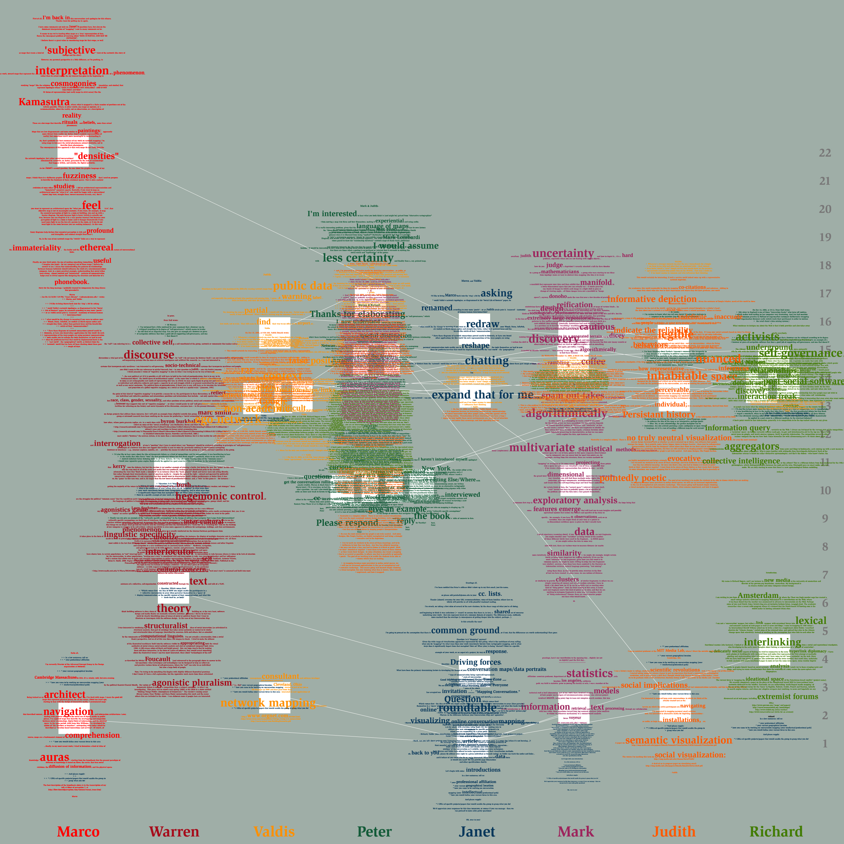
Figure 1.
The Rhythm of Salience
| |
Design Description |
The Rhythm of Salience was commissioned by Janet Abrams and Peter Hall, as part of their
book project Else/where Mapping (Abrams and Hall 2006). They invited six
researchers to participate in online conversations with them on the topic of
networks and mapping and then to visualize the resulting archive. The email
conversation took place among the eight participants over a period of 22 days,
during which a total of 30 messages were exchanged. The Rhythm of Salience
is my depiction of this discussion. | |
| ----- | |
Process and design |
This visualization was created by hand,
using Photoshop to arrange the archived text. The intent was to design a
visualization that could potentially be generated automatically, but that was
not constrained by current computational capabilities; i.e., there are clear
rules that govern the display design, though some of these rules involve
computationally complex analysis. |
|
| Several fundamental ideas guided this
design. 1) Time and temporal rhythms are important (Venolia and Neustaedter 2003), for they
provide a sense of the vitality of the conversation and the urgency with which
different messages were received. 2) It is very useful to see who are the
participants and their patterns of interaction(Donath, Karahalios, and Viégas 1999), for
this is the basic social structure of the interaction. 3) The actual text
should be incorporated into the visualization (Viégas, Golder, and Donath 2006). This
both reveals useful patterns, such as terseness or verbosity, and allows the
viewer to perceive as a unified whole the structure and content of the
conversation. | |
| The Rhythm of Salience shows this conversation as a single image, a grid where the x-axis
has a column for each participant and the y-axis represents time, with the
first day at the bottom. Each message is marked by a white square, located in
the column of the author and at the time of its posting. Thin white lines run
from message square to message square showing reply structure. | |
| The full body text of each message is
displayed, centered on the square that marks its place. Each participant's
words and name are rendered in an individual color. Quotations within a
message are shown in the color of the original author. Most of the text is
rendered in a small font, but certain phrases are featured in larger letters. These are phrases that helped portray the individual participants; phrases both
typical of and unique to that person. | |
| This design makes is possible to quickly
see the social patterns in the conversation, including the scale and temporal
rhythm of the conversation, who are the most active participants, who is
engaged with the others vs. expounding independently, who writes long missives
vs. short notes. Reading the large highlighted words provides a gist of the
conversation and a sense of the individuals' roles and direction. Although all
the text is present on this image, one would not want to try to read the
conversation in this format, for overlapping lines obscure the words. It is a
depiction for seeing overall patterns, for getting the gist of the
conversation, a sense of the participants. | |
| In the particular conversation depicted for
this commission, one can see, for example, that the conversation occurred
mainly in two bursts, the first in response to Janet's initial posting, and the
second, more than a week later, initiated by four short messages
from Peter.
This second part of the discussion was livelier, with more cross exchange and
inter-quoting among the participants. We can see that this exchange was
facilitated by Peter, whose multicolored postings are dappled with snippets
from others. And we see that Marco was a relatively isolated participant,
writing only two messages, with minimal quoting (and unquoted by others,
probably because of their late arrival to the discussion). | |
| From the featured words we get a sense of
the participants as individuals. Peter and Janet, the hosts of the discussion,
used phrases such as expand that for me, “common ground”, “please respond”,
and “thanks for elaborating”, while the other six writers used phrases that
showed their particular approaches to conversation mapping: “Multivariate”,
“exploratory analysis”, “information retrieval” and “uncertainty” come from the
words of Mark, a statistician, while “hegemonic control”, “agonistic
pluralism”, “linguistic specificity” and “interlocutor”, are from Warren, a
media theorist and linguist. | |
| ----- | |
Future work: Automation |
Many features in The Rhythm of Salience could be easily
automated, including generating the basic grid, placing the white squares, drawing
the reply lines and overlaying the text. |
|
| The most challenging feature to implement would be the phrase
highlighting. The basic approach is to find phrases that occur with unusually
frequency in a given text as compared with the expectation set by frequency in
some larger base text. The base text can be the English language as a whole,
or a more restricted set. This approach is used in Themail to visualize
relationships within a user's personal archive of email (Viégas, Golder, and Donath 2006); it is the basis for Amazon.com's “Statistically Improbably Phrases” feature, which compares the phrases in one book with those found in all of that site's searchable books. | |
| In doing the highlighting by hand, I was able to bring in much more semantic
and contextual knowledge than these algorithms possess. Along with using
unusualness as a metric for weighting, I also looked for a body of topically
coherent words. For instance, "data" is not such are rare phrase, but in the
context of Mark's other phrases, e.g. "multivariate","clusters", "features
emerge", it gained salience as part of a cluster of mathematical, statistical
and analytically oriented phrases. More challenging would be to automate the
highlighting of phrases such as “please respond”, and “I'm interested” -- words
that together illustrated Peter's role as conversation facilitator, but which
are not particularly unusual phrases in the context of ordinary usage. | |
| Automating the phrase highlighting that was done by hand is a
linguistic analysis challenge, difficult but not impossible. Although not
directly a problem in the field of visualization, it highlights this field's
need for high-quality data and interpretation. A visualization that highlight
the salient phrases in a text is useless if those phrases cannot be found. | |
| Adding interactivity to the visualization would make it possible
to differentiate among a larger number of participants and to make the full
text easily readable. Our ability to differentiate among non-continguous
colors is quite limited in the best of circumstances and in this application
the available color palette is further reduced because the chosen colors must
both render readable text and give equal weight to each participant. With an
interactive interface, one could choose a participant to highlight and then see
all instances where they are quoted by others. It would also be possible to
pick individual messages and display them in an easily readable format. | |
| ------------- | |
Summary | There are an immense
number of archived conversations. Congressional debates are in this form, as are private personal and corporate
email lists. There are big public discussions on topics from celebrity
sightings to nuclear disarmament. The utility of the archives depends upon the
tools we have for viewing them. The Rhythm of Salience shows one way of
depicting such conversations — a visualization that lets the viewer see in a
single image a complex yet legible set of temporal, personal and semantic
patterns that together create a portrait of the conversation. | |
| ------------- | |
Refererences | Abrams, Janet and Peter Hall, eds. 2006. Else/where Mapping. Mineapolis, MN:
University of Minnesota Design Institute. | |
| Donath, J.,
K. Karahalios, and F. Viégas. 1999. Visualizing conversations. Journal of
Computer Mediated Communication 4, no. 4. | |
| Donath,
Judith. 2002. A Semantic Approach to Visualizing Online Conversations. Communications
of the ACM 45, no. 4: 45-49. | |
| Sack, Warren.
2005. Discourse Architecture and Very Large-Scale Conversations. In Digital
Formations, ed. Robert Latham and Saskia Sassen. Princeton, NJ: Princeton
University Press/Social Science Research Council. | |
| Thomas, J.J.
and K.A Cook. 2006. A visual analytics agenda. Computer Graphics and
Applications, IEEE 26, no. 1: 10-13. | |
| Venolia, G.
and C. Neustaedter. 2003. Understanding sequence and reply relationships
within email conversations: A mixed-model visualization. MSR-TR-2002-102. | |
| Viégas,
Fernanda B., Scott Golder, and Judith Donath Year. Visualizing email content:
portraying relationships from conversational histories. In SIGCHI
conference on Human Factors in computing systems, Montreal, Canada, ACM
Press. | |