Inhabiting the virtual city
Judith S. Donath
5 Visible cities
The urban world puts a premium on visual recognition.
- Lewis Wirth
Wirth made the above comment about the primacy of the visual in urban life in his 1938 essay ``Urbanism as a Way of Life''
(Wirth 1938). He argued that city life was distinguished from other forms of human habitation by its large, dense and heterogeneous population. He described how this population results in a highly diverse and segmented society, composed of individuals whose social role is both fluid and multifaceted. Unlike the village dweller, whose primary contact is with people he already knows, the urbanite encounters vast numbers of strangers, people about whom his only knowledge is where he sees them and how they appear - hence the importance of the visual in the urban world.
The on-line world has many parallels with Wirth's description of the prototypical urban experience. The population is immense and the individual's role is segmented. Here is Wirth's description of the heterogeneity of the urban individual:
By virtue of his different interests arising out of different aspects of social life, the [urban] individual acquires membership in widely divergent groups, each of which functions only with reference to a single segment of his personality... [T]he groups with which the person typically is affiliated are tangential to each other or intersect in highly variable fashion...Partly as a result of the physical footlooseness of the population and partly as a result of their social mobility, the turnover in group membership generally is rapid. (
Wirth 1938)
This description could easily be of today's participant in virtual culture, who contributes to various newsgroups and mailing-lists and who is known in each only in the aspects that pertain to that group. Indeed, the virtual world, with its global population of millions and its highly segmented zones of encounters, constitutes a sort of radical urbanism, with the urban society's characteristics of heterogeneity, fluidity, and fragmentation carried to an extreme.
Notably missing from the virtual city, however, are the striking visuals of the physical city, from the diverse fashions of the passing crowd to the architectural landmarks. In the physical city, the visual scene provides many key social functions: it lets the observer gather information about passersby without engaging in an involved interaction (
Wirth 1938,
Milgram 1977); it sets the tone and atmosphere of the city and of its neighborhoods (
LaGory and Pipkin 1981); and it provides the inhabitants with the landmarks and features that make the environment legible (
Lynch 1960,
Milgram 1977). These functions are all relevant to the virtual city; here, however, the visual design can be created specifically to serve these functions rather than, as is often the case in the physical world, as a secondary effect of commerce or geography.
Making the virtual city visible is the topic of this chapter. Visual representations of the electronic city - the large-scale social landscape - are rare. Most graphical interfaces to electronic social environments depict small group encounters, emphasizing interaction and identity display among a limited number of participants (these designs are examined in Chapter 6). Here I will be looking at designs for the public, open spaces of the virtual world, interfaces that reveal the flow of the crowd and the over-all structure of the community.
There are, of course, innumerable ways of rendering the virtual city. Rather than attempt a preliminary taxonomy of designs, I will focus on one design - Visual
Who, an interactive visualization of patterns of affiliation and presence - and use it as a basis for discussing a range of key issues, including the psycho-perceptual impact of visualization techniques, the imposition of order vs. reflection of complex structures, and the balance between privacy and public spaces.
5.1 Visual Who
|
|
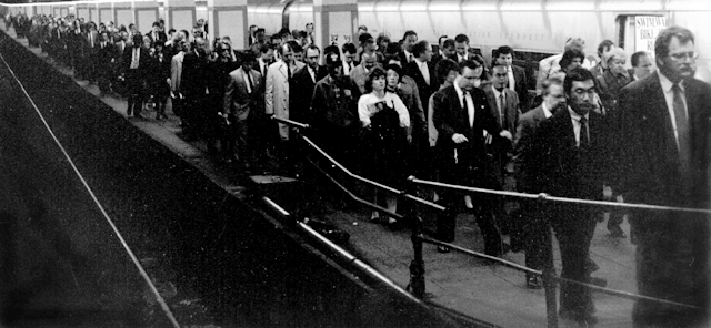
| Commuters, Grand Central
Station
The ebb and flow of rush hour
traffic is one of the many visible
patterns made by the population of
a real-world community
|
The population of a real-world community creates many visual patterns. Some are patterns of activity: the ebb and flow of rush hour traffic
or the swift appearance of umbrellas at the onset of a rain-shower. Others are patterns of affiliation, such as the sea of business suits streaming from a commuter train, or the bright t-shirts and sunglasses of tourists circling a historic site. These patterns help the inhabitants make sense of their community. Similarities in clothing choices unite the members of a cultural group
(Davis-F. 1992) as do the venues and neighborhoods in which they gather
(LaGory and Pipkin 1981). The structure of the community - the social, political and professional clusters of people - is made visible by appearance and location.
The population of an electronic community creates similar patterns. There are times of heavy usage and times when only a few late night users are about; there are mailing lists, newsgroups and chat-rooms that bring together people who share similar jobs or interests. Yet these patterns are difficult to perceive: though the flow of the crowd is recorded in the login database and the community structure is woven into the mailing list memberships, these records have no visible manifestation.
The purpose of Visual Who is to make these patterns visible. It creates an interactively explorable rendering of the social structure of a community, one which allows the viewer to explore the complex patterns of affiliation and also to see temporal patterns of people's arrivals and departures.
5.1.1 Patterns of association
To be sure, it is for the sake of special needs and interests that men unite in economic associations or blood fraternities, in cult societies or robber bands. But above and beyond their special content, all these associations are accompanied by a feeling for, by a satisfaction in, the very fact that one associated with others and that the solitariness of the individual is resolved into togetherness, a union with others.
- George Simmel
The physical Media Lab is the place where people come and work. Its location is a building in Cambridge; its public space is the hallways, classrooms and atrium of that building. Parallel to it exists the electronic Media Lab, an extended community of graduate students, faculty, alumni, colleagues at other institutes, etc. The electronic Media Lab is nominally centered in a computer named media-lab; its public space is a vast network of communications: people posting electronic notices announcing job openings and asking questions about algorithms, people holding mailing list discussions on topics ranging from narrative structure to video compression [17].
These mailing lists reflect the social framework of the community - what its roles are, what its inhabitants care about. On media-lab, there are administrative lists that enumerate the faculty, the technical staff or the doctoral students; research lists for discussing topics ranging from parallel compilers to music perception; and recreational lists such as the ones for extreme skiing or political arguments. In a more formal and bureaucratic organization the lists would be primarily administrative and official; in other settings, they might tend more towards hobbies and entertainment.
People are motivated to add themselves to various lists because they wish to be involved in the discussions (or because their role requires it). Those who are intensely involved in the activities of the electronic community are on many lists, those whose participation is more peripheral appear on only a few. The effect is that everyone creates a simple public profile of their interests and of their role in the community.
Visual Who uses these lists to create an interactive visualization of the associations within the community. When the Visual Who screen first appears, the names of all the people in the community are in a pile in the center of the screen. The user can place any of the mailing-lists as anchors, anywhere on the screen. The names are pulled towards the displayed anchors as if attached to them with springs. How strong a pull each anchor exerts on an individual name depends on the correlation between that person and the mailing list; the greater the correlation, the more strongly the person is drawn towards the mailing-list anchor. By placing additional mailing-list/anchors around the screen, the user creates a conceptual map of the community.
The visualization is dynamic. People with a very close correlation to a given mailing list will quickly converge on it when it is added as an anchor; those who are less similar approach it more slowly. People who are equally related to two lists will end up in between them. A very popular list swiftly gathers to itself names from all over the screen. The dynamics of the visualization are a simulation of a system of springs; when the system reaches equilibrium, each name is optimally situated to reflect its distance from the given mailing-list/anchors.
Visual Who has no knowledge of a given mailing list's meaning nor of its relative importance or frivolity. Its visualization of the community is statistical, based entirely on the information in the alias file.
 |
|
 |
1. A single anchor - in this case a
research group - has been added.
With only one anchor, nearly all
the names would eventually end up
gathered in that corner. |
|
2. An anchor representing the
Lab's committee on academics has
been added. Note how this anchor
has pulled first the faculty
members, followed by the staff. |
 |
|
 |
3. The softball team is added. |
|
4. The holography research group is added. |
Visualizing associations.
These images show the process of
creating a view of the community.
In this representation the faculty
members are yellow; staff is
purple; graduate students are red;
undergraduates are green and
everyone else is blue. The whole
community is shown. The
brightness of a name shows the
strength of the person's attachment
to the given anchor groups. (Click on the pictures for a larger version.)
|
5.1.1.1 Clusters and correlations
Visual Who is designed to visualize group membership, a fundamental part of community structure
(Sproull and Faraj 1993). Rather than showing the exact membership on a list, it shows people's tendency to be like the people on a list.
When a mailing list is chosen as an anchor, Visual Who looks at what other groups all the members of the chosen list also subscribe to and creates a profile of the membership pattern of average member of the list. To figure out how close someone is to that list (how strongly the list is pulling them) is done by comparing the person's pattern of membership with the average membership profile for the list. Thus, one might have a high correlation with a list one is not a member of and vice versa. (A full description of the algorithms used to determine correlations and to simulate the behavior of the spring system is found in this paper.)
Its clusterings are not definitive; rather, they exist within the context of a situation, as defined by the choice of anchors on the screen. Within a given situation, the members are compared feature by feature (i.e. by mailing-list membership). The saliency of a mailing list is determined by its size: smaller lists are considered more salient. (See
Smith 1990 on similarity measurement of cognitive categories;
Lakoff G. 1990 for a broad treatment of categorization.)
5.1.2 Patterns of presence
The city is still the prime place. It is so because of the likelihood of unplanned, informal encounters.
- William Whyte
Activity in the physical Media Lab varies with the time of day. Weekdays, the offices are full and a steady stream of people - administrators, visitors, students, professors - pass through the hallways. Late at night, it is much quieter, but not deserted: there are students working at all hours. During the day, the opportunities for chance encounters, for running into an acquaintance or someone whose research you had been meaning to ask about, are high. At night, there is comfort in knowing that you are not alone, that others, too, are still at work.
Activity in the electronic Lab community similarly ebbs and flows. At four a.m. there are not only the late working students, but also alumni and travelling faculty logged in from distant time-zones. By noon, well over a hundred people are usually present on media-lab, busy sending mail, checking announcements, and reading the news. Yet the usual window onto this community - the terminal screen - shows none of this. It looks like any other screen: a prompt, some text and a cursor. One has little sense of the presence of others.
Visual Who can be set to show only those people who are currently logged in.
The names of those who are active are displayed in bright colors, while those who are idle fade into darkness. One can see the flurry of morning logins and the exodus at dinner time; one realizes that during many late hours when the real-world Lab is empty and quiet, its electronic counterpart is busy with people working at home or logged in from far away. In this mode, Visual Who is a real-time window onto the community, providing the user with an awareness of the presence of others.
Visual Who can also display an animation of activity over a long period of time by using recorded data. This highlights the correlations between activity patterns and group affiliations. The area near an administrative anchor will be nearly deserted at night; graduate researchers leave themselves logged in indefinitely; an upcoming deadline will show a particular research group keeping especially long hours.
 |
|
 |
1. Late at night (4 a.m.) Very few
people are logged in and only a
couple are active.
|
|
2. Midday (1 p.m.) Over a hundred
people are logged in and there is
much activity.
|
Visualizing presence.
Here we see only those people who
are actually logged in. The
brightness of a name shows
activity - the darkest names have
been idle the longest. (Click on the pictures for a larger version.)
|
5.1.3 Design analysis
The goal in building Visual Who was to find ways of making a community's complex and shifting patterns perceivable and legible. The solution is an image in motion: one that quickly shifts to adapt to the viewer's changing concerns; one that reveals information through motion; one that displays the ongoing changes in the community's life. To do this, Visual Who uses motion, color, and interaction to convey the structure of a community. This section covers how each of these methods was used and the characteristics that make it especially useful or problematic in visualizing social information.
A community is both complex and ever changing. New people join, others leave. They are in motion, their activities changing from moment to moment. The topics of interest - the ideas that hold the community together - are always evolving.
Kevin Lynch, in his pioneering book, The Image of the City, wrote:
The city is a construction in space, but one of vast scale, a thing perceived only in the course of long spans of time. City design is therefore a temporal art, but... on different occasions and for different people, the sequences are reversed, interrupted, abandoned, cut across.
(Lynch 1960)
The role of the designer is not to make a single, perfect path, but to create a space that, in Lynch's words, is ``legible'', one that is easily organizable into a coherent pattern. The image of the city - or of a community - is not single frame, but a series of impressions, an image in the round built from a series of successive views.
5.1.3.1 Information via motion
The motion of the names in Visual Who conveys information about the underlying database structure. Changing the anchors sets the names in motion and shows clearly who is most strongly aligned with which anchors. When a new anchor is added, the names most closely associated with its list are quick to stream towards it, followed more slowly by those with weak ties or with very close ties to other anchors. Simply shifting an anchor's position stirs up the names that are most closely aligned with it. When an anchor is deleted, the names that had been pulled towards it are released and spring away.
Motion serves three purposes here: it disambiguates the data, draws attention to changing information, and indicates the imprecise nature of the data.
Like any high-dimensional visualization, the Visual Who display is inherently ambiguous. With every anchor that is placed on the screen, another dimension is added to the visualization. With two anchors, the names form a line. With three, they fill a triangle. Once there are more than three anchors, it is inevitable that some locations will be ambiguous. The dynamics of the visualization help to disambiguate the information by showing which names are most affected by changes in the anchors.
The motion in Visual Who draws the viewer's attention to data that has been affected by a change in the anchor arrangement. Motion is a very effective at making one take notice - Arnheim judged it be ``the strongest visual appeal to attention'' (
Arnheim 1974: 372) - and in a visual crowded environment, the moving objects stand out clearly from the rest. Perceptually, motion is one of the ``pop-out'' phenomena: it is perceived very quickly by low-level visual processes
(Ivry and Cohen 1990). Furthermore, we perceive objects that are moving in the same direction as a group and even in a complex scene, one can focus on the grouping formed by things moving in unison; this is the useful cognitive ability that allows us to detect a predator moving behind a cover of rustling leaves
(McLeod et al 1991). In Visual Who, names that have been similarly affected by a change in the anchor layout form a coherent group while they are in motion, though they may eventually settle in widely scattered areas.
Finally, the bouncing, oscillating spring-like motion of the names when an anchor is added is illustrative of the fluid nature of the data. The people in the community do not fall neatly into crisply defined categories, but rather tend to cluster according to a looser set of similarities and affinities. If the names were to snap immediately to position, the visualization would give an impression of precision and finality, which does not reflect a community's malleable structure.
5.1.3.2 Color
Visual Who uses hue to show membership in particular lists. This makes it possible to use to find specific information, such as who is an avid cyclist or who might be able to answer a signal processing question. More importantly, it is through the combination of screen location (which shows affinities through the relative pull of the anchors) and hue (which shows specific memberships) that the social patterns emerge.
Clusters of color are easy to follow. As the anchors change, the rearrangement of the color patterns is immediately noticeable, as some flow cohesively to a new location or are scattered throughout the space. With the Media Lab database I often use hue to indicate institutional roles, distinguishing faculty (orange), staff (thistle), graduate students(red), etc. In one example, adding the skateboarding anchor pulled one of the professors from the cluster of faculty at the other end of the screen, so that he stood out as an isolated spot of professorial orange in a sea of student green. It was a professor of music and, though certainly not a skateboarder himself, he was involved in many projects with the skateboarders, most of whom were musicians. Color highlights anomalies and other interesting data points.
Hue is best used as a ``dimension of distinction''
(Arnheim 1974), a means of separation rather than comparison. Although the visual system can distinguish many thousands of colors [18], far fewer - perhaps 20 or so at the most - can be used in an image to demarcate categories of data (
Tufte 1990; see also
Lakoff G. 1990 on the cultural and neurophysiological basis for color categories). And, while there are many ways to logically arrange colors (e.g. by their position in the spectrum), using them to express ordered relationships is seldom intuitive [19].
Unlike hue, brightness is well suited for showing quantitative comparison. In Visual Who, brightness is used to show the relative strength of all the springs attached to a name. The brightest names are those who are the most involved with the interests highlighted by the current set of anchors. Depending on the suite of anchors chosen, some arrangements may have only a few bright names, indicating that the anchors select a specialized segment of the community, while others combinations are more uniformly lit.
Well used, color can be an important element in developing the ambience of an on-line environment. Color memory is strong
(Salomon 1990) and demarcating borders and neighborhoods through changes in color scheme is one approach to making the space more legible.
Visual Who allows its users to set which colors mark the members of which groups and one can make a set of such configurations, each highlighting different pattern in the community. This program does not, however, provide any assistance in choosing suitably expressive combinations. Ideally, since most users are not sophisticated designers, they should not be required to pick individual colors, but should be able to choose among color suites suggested for their perceptual qualities and cultural meaning. (See
Bender and Jacobson 1996 for an in-depth discussion of issues in the design of such a color choosing system.).
Though color can be very useful in visualizations, providing an additional dimension for data discrimination and enhancing the visual appeal of the design, using color well can be tricky. Tufte warns:
Tying color to information is as elementary and straightforward as color technique in art, ``To paint well is simply this: to put the right color in the right place'' in Paul Klee's ironic prescription. (
Tufte 1990)
One of the most difficult issues in using color in a visualization is avoiding spurious color-induced interpretations of the data. For example, some colors stand out vividly, while others recede. If two data sets are colored yellow and blue, the former will stand out prominently and will thus appear to be more important, whether or not that was the designers intent. That is, unless the background is yellowish or brownish, in which case the blue would stand out strongly and the yellow would fade. Color, said Albers, ``is the most relative medium in art'' (
Albers 1975). Culture, as well as perception, affects the meaning ascribed to colors, such as the association. in contemporary Western society, of pink with femininity and of red, white and blue with American patriotism. Color can make an image look corporate or childlike, militaristic or sophisticated. The designer of any sort of graphical representation - and especially of a social environment - needs to be aware of the often subtle ways that color can shade meaning.
5.1.3.3 Interaction
Visual Who does not create a definitive view of the community; instead, it provides the means for the user to explore the social space. Each arrangement of anchors is a sketch, an impression, of the community. One gains a full picture of the community by looking at many such sketches, for each rearrangement reveals different patterns and alignment, filling in a little more of the picture of the whole community. To encourage such exploration it was designed so that it is quite easy to move the anchors about, to clear them all and start over with a new set.
One of the most important design principles in creating a visualization is to use graphics and techniques that are well suited to the ``sense and substance'' of the data
(Tufte 1983). It is notoriously easy to create an authoritative looking graph from subjective or otherwise inexact data. A community is complex and mutable; there is no single static image that perfectly captures its structure and relationships. For the participants, the contours of the community are highly subjective; each person sees in it in the context of his own relationships. An interactive visualization, with easily configurable viewpoints, is one way to provide the viewer with an intuitive sense of the subjective nature of social visualization.
The importance of interactivity in visualizing large databases and multivariate data has been noted by many researchers (
Buja et al 1991;
Buja et al 1991;
Keim and Kriegel 1994;
Shneiderman 1994). Reports from a wide range of interactive visualization techniques observe that interactive systems are effective because they allow the user to create numerous simple and easily comprehended images and because they clearly show the effects of query modification. Shneiderman coined the term dynamic query to describe systems that provide a rapid re-rendering of the interactive requests. His experiments have shown that people not only enjoy using such systems, they also learn a great deal about the data they are exploring
(Shneiderman 1994).
Interactive systems appeal to our desire to adjust our environment. Whyte, observing that before sitting in a chair, people will, move it a few inches this way and that, finally ending up with it in about its original position, noted ``The possibility of choice is as important as the exercise of it... These moves are functional. They are a declaration of one's free will to oneself, and rather satisfying. In this one small matter you are the master of your fate.''
(Whyte 1988)
5.1.4 Future work on Visual Who
The next stage in this work is to accommodate larger populations. The implementation at the Media Lab pushes the limit of legibility with approximately 1100 community members. To expand further, the system must make it possible to focus on specific portions of the population. Potential useful approaches include color and transparency manipulations (
Colby and Scholl 1991), 3-dimensional data navigation (
Drucker 1994;
Rennison 1995) and zoomable interfaces (
Perlin and Fox 1993;
Furnas and Bederson 1995).
The data sources currently in use in Visual Who, the alias and the utmp file, are interim sources, artifacts of Unix and of centralized computing. How does one show a distributed electronic community? What are its definitions of member or presence? One project is to use this interface to visualize home pages on the Web, using links and phrases in place of mailing list membership; the research issues here are bounding the community and filtering the data.
Another goal is to make it an inhabited environment. Currently, Visual Who shows a city of data about people; people are represented in it, but the people are not in it. Presence on the screen represents presence elsewhere: you are seeing if people are logged into a central computer (or whatever data is used to measure presence). This presence should be more tangible; one should be able to not only observe presence, but to experience it. The first step is to add basic communicative ability: if I see by the Visual Who screen that you are around, I should be able to send a message through it to you. The ultimate goal is for the graphical representation of one's community to be the access point to it.
5.1.5 Related projects
Visual Who, of course, only one among many potential ways of visualizing the electronic city. There is other data to show, other ways to show it.
Several other researchers have explored social phenomena using visualization techniques. These works show the patterns of individual inter-relationships, in contrast with Visual Who, which illuminates clusters of affiliations. Eick and Wills use email traffic patterns as one example in their network visualization research
(Eick and Will 1993); Robertson et al show the organization of a large corporation in their work on visualizing hierarchical information
(Robertson et al. 1991); and Krempel looks at ways of visualizing anthropological observations of social networks
(Krempel 1993). Visualizing social populations is not a heavily researched field and most of the work that has been done is aimed at studying the population, rather than on using the visualization as part of a social environment.
5.2 Datascapes and cybervilles
The Virtual City as visible metropolis pulsating with light and activity has thus far been built only in the realm of science fiction. Yet these fictional cities may prove to be quite influential, for they guide the imaginations of many of today's system and interface designers.
Two schools of design can be discerned in the more frequently cited works. The first, epitomized by William Gibson's cyberspace stories, is the virtual city as abstract datascape, with glittering swirls and towers of financial data and corporate secrets, extending out to the infinite black universe
(Gibson 1984). The second, detailed by Neal Stephenson's Metaverse descriptions, is the virtual city as traditional town, its orderly streets lined with shops and cafes
(Stephenson 1992).
Cyberspace.: A consensual hallucination experience daily by billions of legitimate operators... A graphic representation of data abstracted from the banks of every computer in the human system. Unthinkable complexity. Lines of light ranged in the nonspace of the mind, clusters and constellations of data. Like city lights, receding....[ellipses original] (
Gibson 1984).
Gibson's cyberspace has the aesthetics of scientific visualization. People are absent. Technology as isolator is central theme: he writes of plug-in sensory stimulation units, hypnotized hookers with simulated anatomically correct responses, solitary expeditions into vast datascapes. Yet it is GIbson who coined the world cyberspace and it is to his works that people often refer when talking about the future wonders of the virtual world.
Stephenson's vision of the future is more prosaic. His virtual landscape, the Metaverse, is fully inhabited. He is most well known for his description of avatars (see Chapter 6), graphical representations of people on-line. Though his architecture has not had the fascination of Gibson's cyberspace, it is more in accord with the spaces that people are actually building - the e-cafés and cybervilles that are popping up around the Web. Stephenson's vision draws so much from the real world that it gains little from being in an entirely new and plastic medium. There are buildings and streets and, though one can travel faster than in reality, it still takes a long time (and an appropriate vehicle of transportation) to get anywhere. What is most interesting about his world is that it is heavily populated and the experience is shared.
There are many references on the Web today to both of the literary models. There is a system called ``The Black Sun'' after the bar in Snowcrash and there is an on-line service called ``SenseNet'' after a multinational entertainment conglomerate in Neuromancer. The term avatar has passed into common use (n.b. Stephenson is not the sole progenitor of this usage.) As for actual interfaces, the influence is less obvious, largely because the Web's current technology is so limited. There are occasional collective art projects that create simple datascapes; there are the cybervilles, mainly Main Street illustrations as fronts for text sites. Neither of those are inhabited spaces. There are however, a growing number of avatar worlds, which are shared, graphical spaces (see Chapter 6).
The essential dichotomy between the datascape and the cyberville - between Gibson's cold abstraction and Stephenson's literal re-staging - is not necessarily in their level of abstraction, but in the level of planning. The cyberville is very highly planned: each piece is deliberated created as part of the city representation. The datascape is more organic: it is a representation of ongoing activity. In Gibson's version, the represented activity is corporate, yet it need not be. It can (and Visual Who is a prototype of this) be an image of the things people are doing, associations they are making and the data they are sending in the course of pursuing their business, their education, and their lives.
In the essay ``A city is not a tree'' Christopher Alexander wrote about the danger of deliberate design
(Alexander 1965). A living, vibrant city, he said, is a complex structure, growing organically through the process of human activity. This complexity, which is a prerequisite for a ``living city'' cannot be meticulously planned, for if we impose a design it will be too simple and sterile. He criticized those who tried to recreate the great cities of the past too literally, rebuilding their ``plastic and physical characteristics'' instead of trying to understand their ``abstract ordering principle''. From this principle the city should be ``grown'' rather than ``thought out'', for it will then be sufficiently complex and interlocking to make for a living city [20].
The cyberville is the city rebuilt in its ``plastic and physical characteristics''. The virtual datascape - in which the representation reflects the potentially far more complex arrangements of data, networks, messages and activities - is potentially a vastly more complex, organic structure. The point is not that the image must be abstract - and certainly not cold and forbidding - but that it should reflect the presence of the crowd, its size and activity: the big, unplanned, patterns.
5.3 Public space and privacy
The final section of this chapter deals with privacy. Privacy is less of an issue in the cyberville model - or in the deliberate self-representations of today's Web pages: the words and images are deliberately chosen to represent oneself or one's business; they are clearly meant for public consumption. A visualization of aspects of ongoing behavior is something else - do you know where and when your actions are visible? what patterns may be revealed? New technologies, including data visualization and the monitoring of on-line behavior, raise significant concerns about the erosion of privacy. Many of these issues revolve around the ownership of personal information: who should have access to information about one's behavior? An application such as Visual Who, with its ability to highlight patterns within a community, could be a marketer's dream.
Yet making all data private is not a good solution: public space is important to community. There are very few paeans to the paranoid suburbs, where no one knows a neighbor's name and the shades of every house are drawn. The goal is to strike a balance, to have a clearly defined public space where one assumes that actions are visible.
Public spaces [21] serve many functions. Streets, for example, are for transit - for getting from one place to another. They are also informative: walking about, the inhabitants learn what is available in the city. ``Public space is the stage upon which the drama of communal life unfolds. The streets, squares and parks of a city give form to the ebb and flow of human exchange.''
(Girouard 1985)
In a city, there are many levels of privacy. Streets and many parks, for instance, are fully public areas: they are open spaces that anyone may enter and one's actions and appearance is viewable by all. There are also semi-public places, such as stores and restaurants. Here, one's behavior is more constrained and access may be limited, e.g. by price or dress code. Furthermore, within these more or less public spaces there are smaller, more private gatherings, such as one's table at a restaurant. There are complex social rules about the privacy and accessibility of these groups and an important part of cultural fluency is knowing when one is free to join a group (or to exclude others). For instance, joining a table of strangers in a restaurant may be a friendly gesture or an outrageous breach of social mores, depending on what country one is in, the type of restaurant, the number of people involved, and the time of day. As social beings, our involvement with others can be on many levels of intimacy: people flock to restaurants to be in the presence of others, but simultaneously protect the privacy of their conversation and their immediate physical proximity.
Public space, in the virtual world, is public data. Public, however, does not necessarily mean open to the entire world. A better phrase is communal data: information that individuals knowingly contribute to create their community's public space. Visual Who is created with communal data; it is designed to be a tool for use within the community. It is can enhance privacy or damage it, depending upon the circumstances of its use.
A well designed interface to a virtual environment should be able to support a range of public and private spaces. One of its functions is to differentiate the public from the private. In the physical world, one knows that one's actions on the street are public and one believes one's actions at home are private - and adjusts behavior accordingly. In the virtual world, establishing clearly demarcated public space can enhance privacy by increasing people's knowledge of what information is private and what is known to all.
Researchers at Xerox EuroPARC found that introducing a series of privacy protections and awareness mechanisms into a virtual space (in this case, a shared audio and video environment) made the participants much more willing to make themselves available - to present themselves in public - in the environment. Dourish
(Dourish 1993) observed three reasons for this: they trusted that they could remove themselves from the public space when they wished to; the awareness mechanisms gave them feedback about how open or sheltered was the space they were in; and multiple levels of access were provided, giving the participants control over how visible and accessible they were.
With social interfaces, it is important to consider the privacy of the data underlying the design. Visual Who used data - the mail aliases and the login record - that were already public within the community. Compare this with a project such as HierNet
(Eick and Will 1993), an interactively explorable visualization showing the pattern of individual mail messages passed within an organization. In many communities, who communicates with whom is considered quite private. The appropriateness of either visualization depends on the community's standards of what is public data; similarly, the community may consider data to be public within its confines, but not viewable from outside. [22]
Visualizations can reveal previously invisible patterns - that is, in fact, their purpose. Data that is publicly accessible in its raw state may seem far less innocuous once it is compiled or visualized. The Usenet search engines mentioned in Chapter 3 are an interesting example. These are services that have made databases of postings publicly available, along with the capability to search for all the articles by a given author. While Usenet postings have always been public, people often considered newsgroups to be semi-private spaces: though no walls kept Aunt Emily out of alt.sex.bondage, one assumed she wouldn't venture there and thus one's postings were safe from her eyes. With the ability to easily compile a comprehensive list of someone's postings, this assumption of tacit privacy disappeared. Now, anyone - friends, employers, aunts - can quickly see all the newsgroups one participates in and all the postings one has made.
This is not necessarily a bad thing. For example, there has been relatively little outcry about the Usenet search services; instead, the implicit understanding about what is private space in Usenet seems to be changing
(Donath n.d.). Perhaps one reason that this loss of privacy is tolerated is that the Usenet community itself benefits from this service, for it gives participants the chance to see a more well-rounded view of their fellow contributors.
This fundamental trade-off, between personal privacy and social identity, occurs in both the real world and the virtual. The archetypal village that is so often invoked as the ideal of community togetherness is also a place of minimal privacy, a small world in which everyone's comings and goings are noted and judged; its opposite is the suburb, where all activity occurs in private homes and the inhabitants shuttle off to school and work secluded in their individual automobiles. The inhabitants have privacy, but not community, for a community cannot form if its potential members are seen only as ciphers.
Today's on-line world resembles the suburb more than the village: our fellow inhabitants are vaguely featured individuals glimpsed in occasional exchanges. By moving to a graphical environment in which we see each others patterns of activity, we lose some privacy and gain a clearer picture of each other. Whether this shift in the balance between private and public is beneficial depends in part on how the new environment is designed: does the community accept the revelation of the information? who has access to it? how clearly are the distinctions made between the private and the public?
Technologies that make these distinctions clear and intuitive in the virtual world make public space more vital and private space more secure.
previous · · ·
contents · · ·
next