|
l o o m 2
|
|||||||||||||
|
w o r k i n p r o g r e s s
|
|||||||||||||
|
professor
judith donath . danah boyd . hyun-yeul lee . dan ramage
w/ support from scott golder . ming-en cho . jonathan goler |
|||||||||||||
|
|
|||||||||||||
| Phase 09 - How do we think about different environments? | |||||||||||||
 |
What are the qualities that makes one intuitively sense a type of environment? For example, when I enter a space I may want to sense that the people making up the space are friendly and lively. I also may want to sense that I do not want to enter a space that is gloomy and offensive.
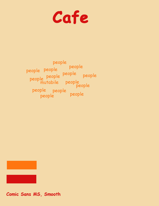
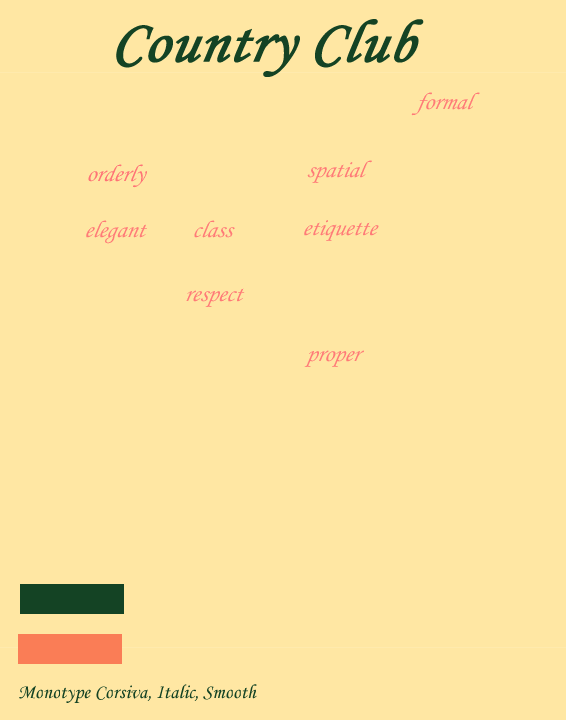
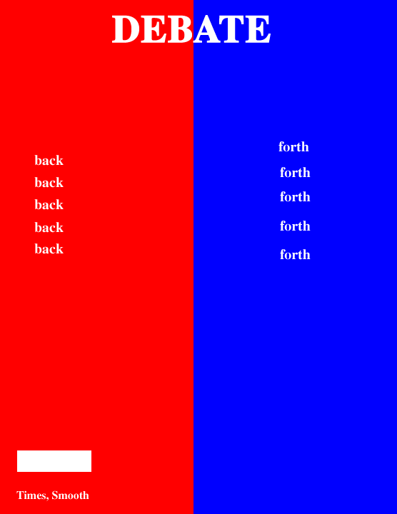
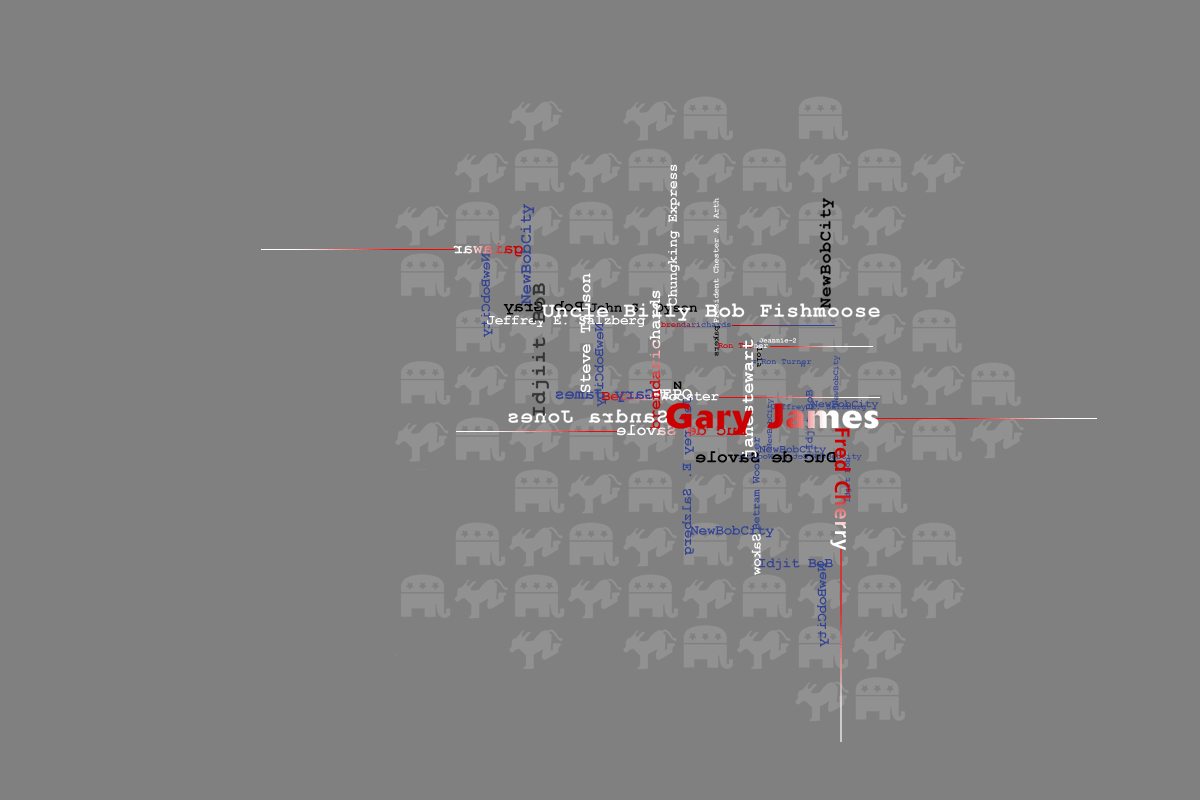
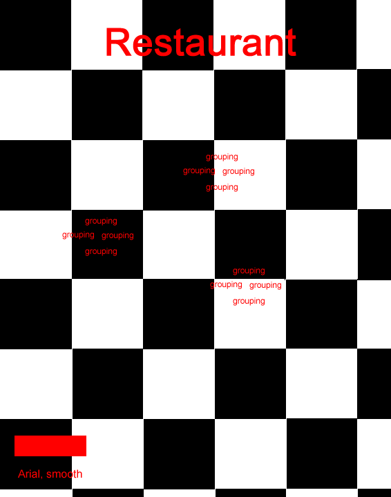
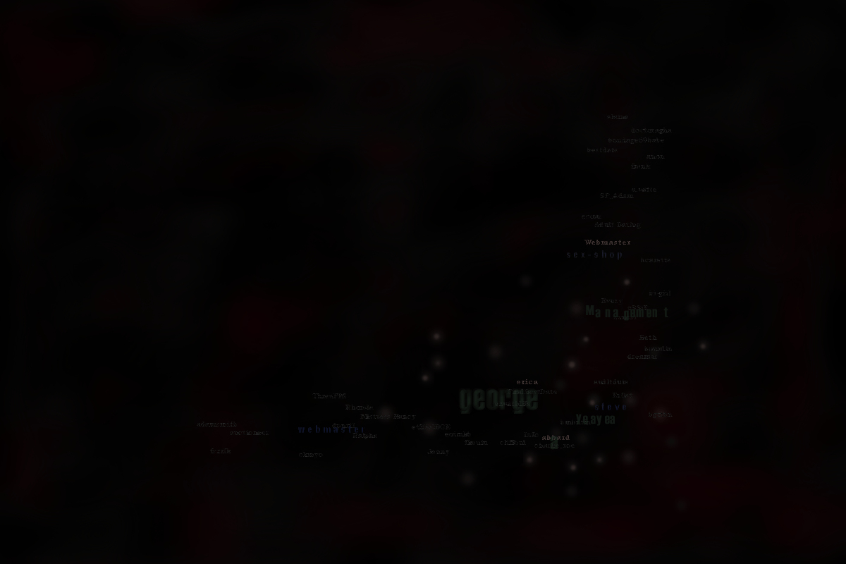
In order to have a better understanding of what makes up an environment, we started to look at different environments: cafe, country clubs, debates, restaurants, and urban decay. What was important in this exercise to depict such environments was the use of colour and font family. For example, as we thought of a country club versus an urban decay, the font for the country club was more polished and serifed, whereas an urban decay we envisioned used eaten away type with the sense that it was a dark and gray environment. The way type interacted with each other was another avenue to explore. For example how does the tension feel when type is hitting against each other or if the type is in a different orientation what does that convey? What does it feel like when type is aligned in a perfect line versus type floating about without any design rules? When you use red as a background in a space how does this differ to a space that is composed of the colour gray or yellow? We were trying to explore the subjective moods of an environment. This may have brought out a lot of the stereotypical images we thought of or saw of a type of environment. Our goal was to explore how we could translate such moods of environments found in physical settings to online environments. |
||||||||||||
 |
|||||||||||||
 |
|||||||||||||
 |
|||||||||||||
 |
|||||||||||||
 |
|||||||||||||
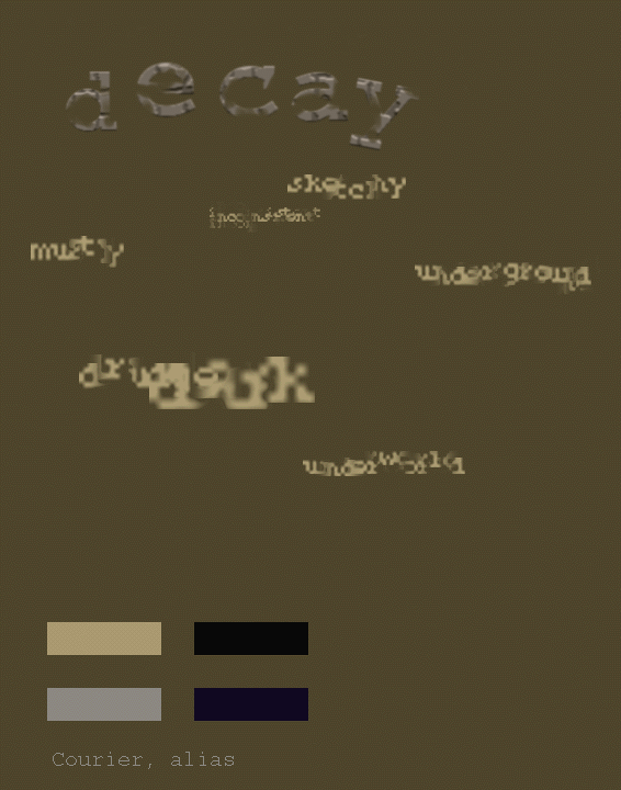 |
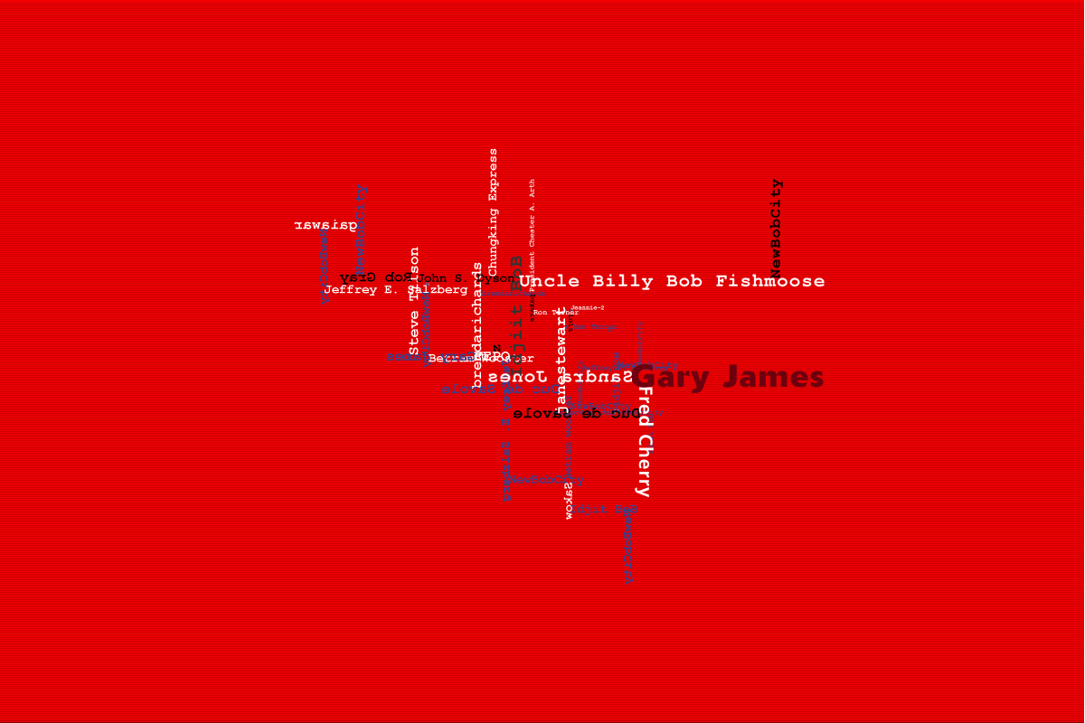
The last three images on the left is a depiction of urban decay. Eaten-away type and use of dark colours were the primary ingredients in this depiction. The way type was laid out depended on the idea of a ring leader being the most visible and others surrounding or hiding away from the ring leader. We were thinking about all the sex ads that spam people's inboxes - how this was never responded to but easily forgotten.
Here we learned that the visualisation needed to be a combination of type and image to help depict a mood of an environment. |
||||||||||||
 |
|||||||||||||
 |
|||||||||||||