SpringDemo
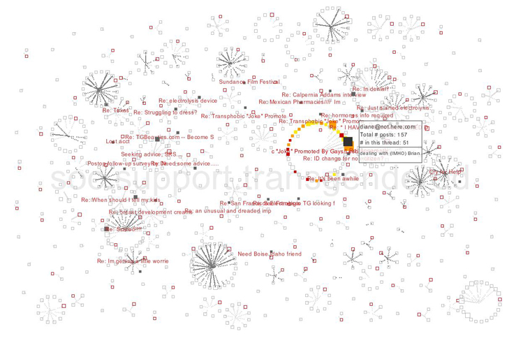
To distinguish between recent posts and posts that are part of an active conversation, we built this visualization tool based on actual data. This prompted us to think about how to convey the people who participate in a conversation relative to one another. The idea of a conversation circle evolved from the natural geometry of group conversations. No matter how a population is distributed, if there is something of interest that brings them together, a ring will automatically form, providing the most efficient arrangement for crowds and conversations alike. Like the geometry that forms in physical conversations, each person in our virtual conversation helps construct a larger social circle of people conversing with one another.
As people converse, the shared information flows from the poster to center of the group, representing a contribution to the common good. We also wanted to emphasize a person's frequent contributions to the conversation, so we related the size of an individual to the number of posts contributed to the conversation.
Although we wanted
to represent an individual through dense flexible forms and use actual
message text in the flow of conversations, we quickly learned that speed
continues to be a limiting factor in large-scale interactive visualizations.
Temporarily, we decided to use abstract representations that become text
as you narrow your focus on a specific conversation or person.
When we started representing
multiple conversations in the same panel, another concern arose. How do
you represent an individual's participation in multiple conversations?
Physically, it is challenging to be actively part of multiple conversations,
unless they are geographically co-located. Since most people in Usenet
are involved with multiple ongoing threads, trying to co-locate them is
a graph theory nightmare. Although we temporarily addressed this by splitting
individuals into parts, with a physical representation in each conversation
and links appearing through interaction, this is neither desired nor intuitive.
Coming up with a better way of solving this requires future work.
While using live data, we also wanted to visually explore the statistical aspects of actual newsgroups, so as to compare various aspects of different groups. As a result, we were able to visually differentiate groups based on differences in number of conversations, participants, and messages per thread. Through interaction, we could explore a thread's social network, statistical data on individuals, which conversations an individual participated in, and topics addressed. Although these latter attributes were arbitrarily related to visual components such as color, visible differences between the groups emerged immediately. For example, the image represents soc.support.transgendered, a support group with long threads engaging many participants, quite a few of whom post multiple times. When we used this same technique to visualize alt.transgendered, a newsgroup overrun with advertisements, no conversation clusters emerged. The entire landscape consisted of individual posts, with only a few two-person exceptions. On inspection, we realized that when people posted more than once, they posted new posts in a series, with identical content in each post. Although these two groups appear to be about similar topics, the social interaction differed enormously.
Program - SpringDemo
Note: this demo is only available within the Media Lab.
More images are available here.