|
l o o m 2
|
|||||||||||||
|
w o r k i n p r o g r e s s
|
|||||||||||||
|
professor
judith donath . danah boyd . hyun-yeul lee . dan ramage
w/ support from scott golder . ming-en cho . jonathan goler |
|||||||||||||
|
|
|||||||||||||
| Phase 05 - Macro view of the landscape of a newsgroup | |||||||||||||
 |
In the previous phase we tried to explore the evolution of shape form in relation to a representation of an individual. In this phase we started to focus on visualising the macro level - a landscape that depicts many newsgroups and the relationships among them.
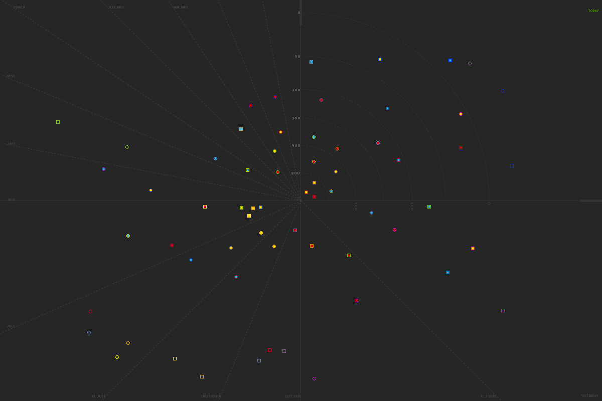
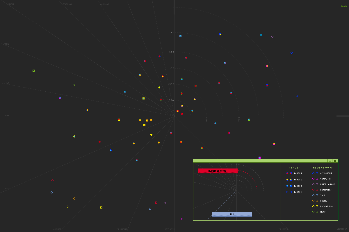
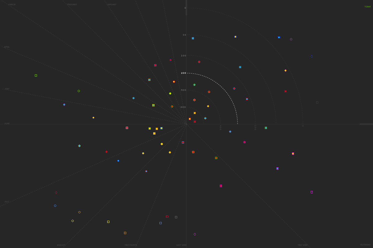
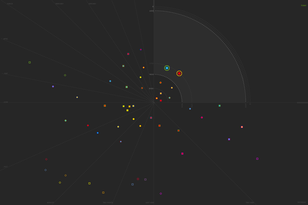
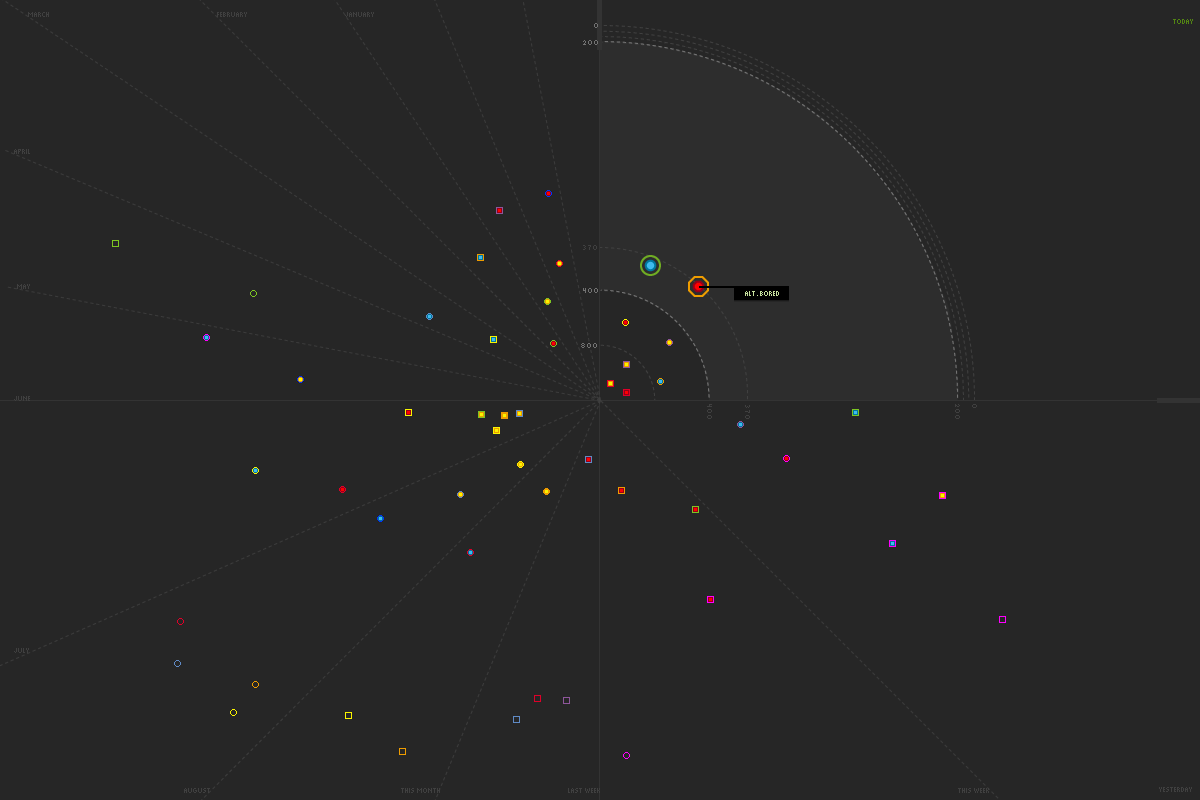
The first six images on the left show an attempt to map newgroups by the total number of posts they have against time (when was the last message in the thread posted?). Here, the number of posts uses the radius of the circle (centre point to away from centre point); the number of posts get larger towards the centre of the screen. Therefore one can imagine that the most active newsgroups will be found towards the centre of the screen. The difficulty of this type of mapping is that the centre area can become over-flooded and cluttered, thus hard to read. So we tried to remedy this problem by giving the ability to the user to zoom in into sections of the screen; this would zoom in and visually make that space larger so that newsgroups and their standing become legible. While a certain zone is zoomed in, for example "I want to see all the newsgroups that have between 200 - 400 posts in their thread and that the latest post being today...", then this section will be zoomed in and the rest of the sections along that axis will be pushed back like a tide of waves. We also thought of mousing over a shape will inform the user the name of the newsgroup, rather than all shapes flagging their group name. Perhaps it would be an interesting idea to flag the name of a newsgroup only if there is no user interaction and if the latest post uploaded to the system matches the current viewing time of the user. In this exercise, we understood the importance of time and saw the opportunities of using different aspects of time which may inform subtle social patterns. |
||||||||||||
 |
|||||||||||||
 |
|||||||||||||
 |
|||||||||||||
 |
|||||||||||||
 |
|||||||||||||
 |
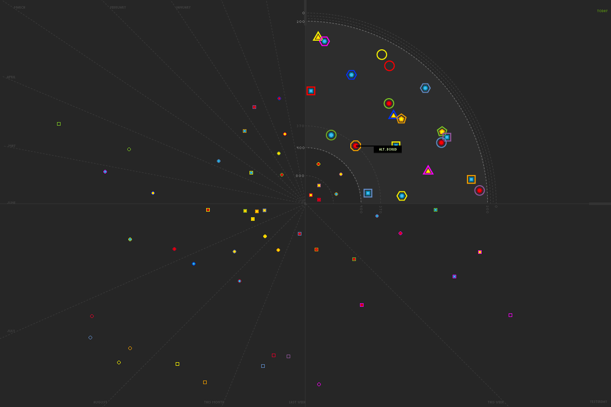
The image on the left shows where we started to think of the idea of information swiping through, in a clock-wise motion.
The colour of the zoomed in shapes show a gradient between two colours, showing the idea of change. For example this change can represent the mood or tone of the group, the level of activity, how old the group is compared to other groups, etc. |
||||||||||||
 |
|||||||||||||
|
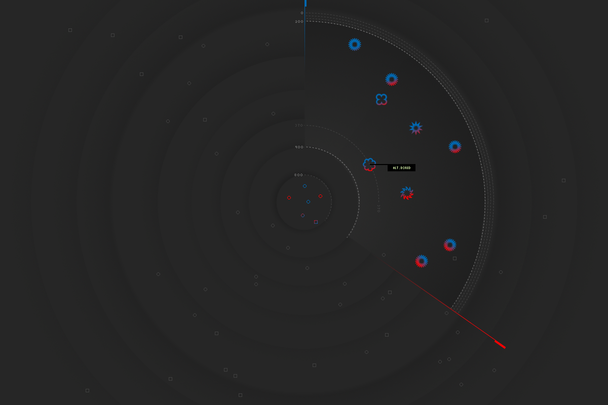
In this final visualisation, the use of graphical elements were simplified. For example, divisions amongst sections no longer used lines but points along the major sections. The use of various colours was minimized to one colour on the general landscape, which gives a focus to the shapes on that level of reading. But when the user zooms in, colour is used to provide information of the groups in that section.
|
|||||||||||||
 |
|||||||||||||