|
l
o o m 2
|
|||||||||||||||||
|
w
o r k i n p r
o g r e s s
|
|||||||||||||||||
|
professor
judith donath . danah boyd . hyun-yeul lee . dan ramage
w/ support from scott golder . ming-en cho . jonathan goler |
|||||||||||||||||
|
|
|||||||||||||||||
| |
|||||||||||||||||
|
Visualizing activity. |
|||||||||||||||||
|
Based on the data described in understanding activity, we created a series of maps between the information and a few visual forms, so that we could better grasp what information was accessible. Like the previous pieces, each of these are considering how activity relates to the other features. In each of these pieces, color is correlated with activity and the size of the elements are dependent on the other feature. These pieces attempt to systematically enhance the outstanding elements available in each data set. |
|||||||||||||||||
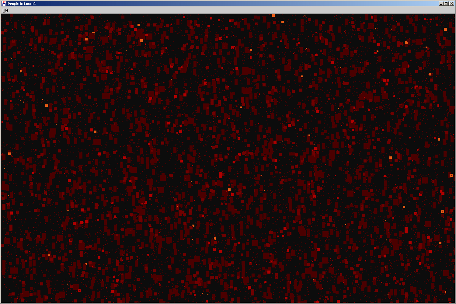 |
Orphans. In this piece, size was used to emphasize people whose posts are rarely orphaned. | ||||||||||||||||
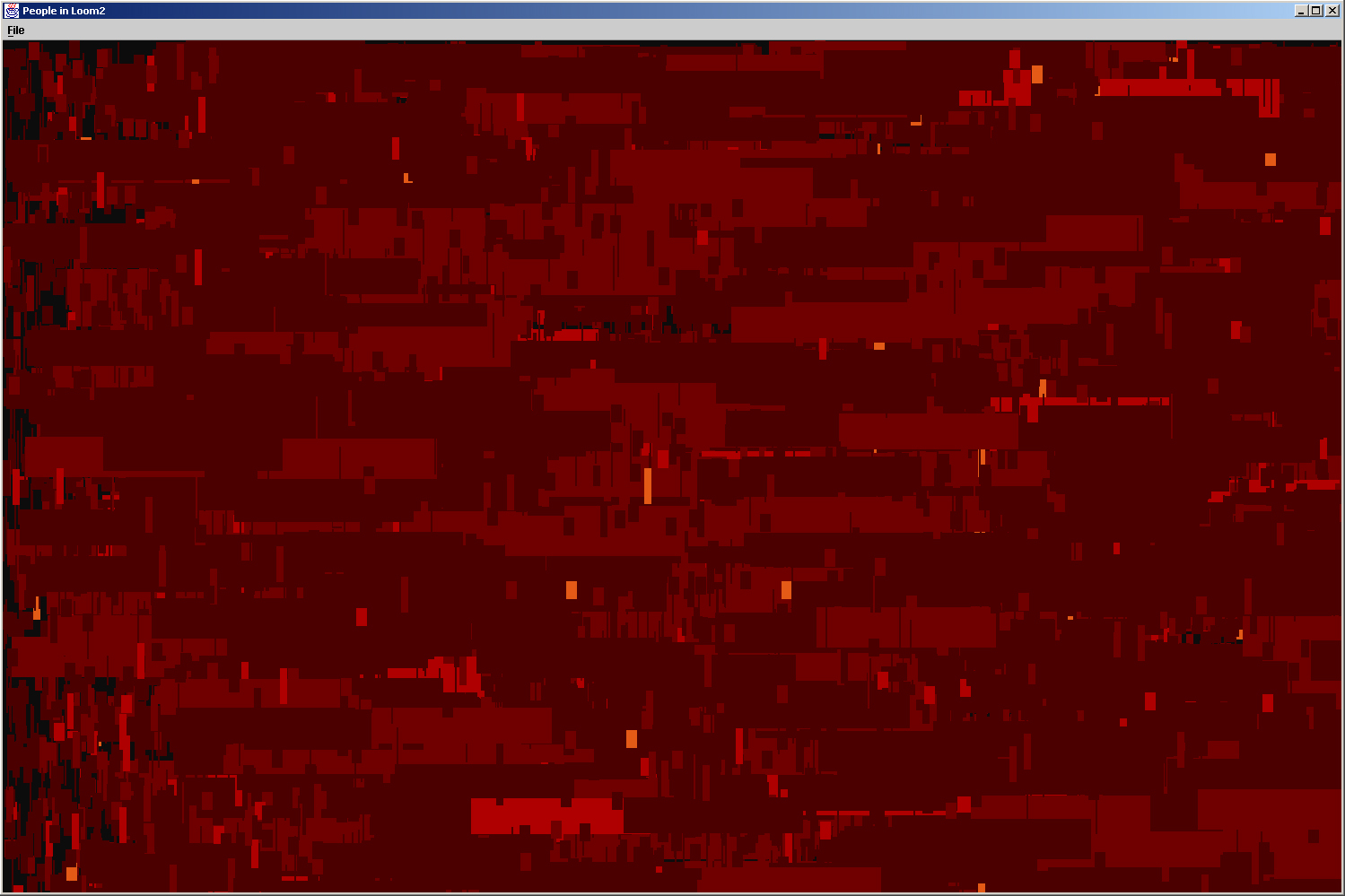 |
Responses per Person. Width allows a quick vew of people who get innumerable responses. | ||||||||||||||||
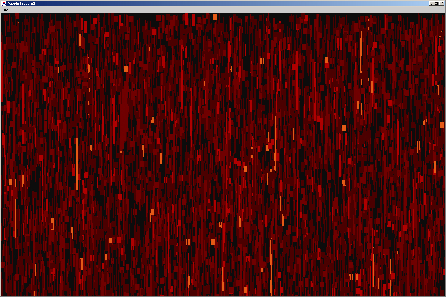 |
Anger. Height is used in this piece to give us an understanding of very angry individuals. |
||||||||||||||||