
The goal of Visual Who is to make the social patterns of an electronic community visible. This paper discusses Visual Who within the context both of social interface design and of data visualization.
The population of an electronic community also creates many patterns. There are times of heavy usage and times when only a few late night users are about; there are groups of people who share similar jobs or interests. Yet here, the patterns are hidden within masses of data: the rhythms of the community's activity exist within the record of login and idle times; the clusters of friends and colleagues are recorded in the mailing-lists. The screen - one's window onto the virtual world - reveals little of this activity.
Visual Who makes these patterns visible. It creates an interactive visualization of the members' affiliations and animates their arrivals and departures. The visualization uses a spring model. The user chooses groups (for example, subscribers to a mailing-list) to place on the screen as anchor points. The names of the community members are pulled to each anchor by a spring, the strength of which is determined by the individual's degree of affiliation with the group represented by the anchor. The visualization is dynamic, with the motion of the names contributing to the viewer's understanding of the underlying data.
This visualization technique is well-suited to social visualization problems for two reasons. First, it shows group affinity, rather than membership: it brings together people who have a great deal in common, rather that simply those who share a particular membership. Thus, it does not create a falsely precise rendering of the society. Second, the simple interface and dynamic motion encourage the user to explore the structure of the community. By allowing the user to create many different views of the community structure and to observe the temporal patterns created by the members' activity, Visual Who makes it possible to see an multi-faceted overview of a complex society.
This paper begins with a discussion of social visualization and the data that can be used to visualize a community's patterns of association and activity. Next, Visual Who is described from the user's standpoint followed by an explanation of the spring system model used in the implementation. The final section of the paper discusses the major design issues raised by this application and points out some directions for future work.
It is, in many ways, a typical visualization problem. The data exists: the task is to make it visible.
"To be sure, it is for the sake of special needs and interests that men unite in economic associations or blood fraternities, in cult societies or robber bands. But above and beyond their special content, all these associations are accompanied by a feeling for, by a satisfaction in, the very fact that one associated with others and that the solitariness of the individual is resolved into togetherness, a union with others".The physical Media Lab is the place where people come and work. Its location is a building in Cambridge; its public space is the hallways, classrooms and atrium of that building. Parallel to it exists the electronic Media Lab, an extended community of graduate students, faculty, alumni, colleagues at other institutes, etc. The electronic Media Lab is nominally centered in a computer named media-lab; its public space is a vast network of communications: people posting electronic notices announcing job openings and asking questions about algorithms, people holding mailing list discussions on topics ranging from narrative structure to video compression *.- George Simmel
These mailing lists reflect the social framework of the community - what its roles are, what its inhabitants care about. On media-lab, there are administrative lists that enumerate the faculty, the technical staff or the doctoral students; research lists, for discussing topics ranging from parallel compilers to music perception; and recreational lists, such as the ones for extreme skiing or political arguments. In a more formal and bureaucratic organization the lists would be primarily administrative and official; in other settings, they might tend more towards hobbies and entertainment.
People are motivated to add themselves to various lists because they wish to be involved in the discussions (or because their role requires it). Those who are intensely involved in the activities of the electronic community are on many lists, those whose participation is more peripheral appear on only a few. The effect is that everyone creates a simple public profile of their interests and of their role in the community.
In the physical world, the structure of the community - the social and professional clusters of people - is made visible by appearance and location: similarities in clothing choices unite the members of a cultural group [5] as do the venues and neighborhoods in which they gather [19]. In the electronic domain, these associations are woven into the patterns of discussion list membership, these lists being, in effect, the gathering places of the online community. Yet these patterns are hard to discern; not because they are faint, but because they have no visible manifestation.
Patterns of presence
Activity in the physical Media Lab varies with
the time of day. Weekdays, the offices are full and a steady stream of
people - administrators, visitors, students, professors - pass through
the hallways. Late at night, it is much quieter, but not deserted:
there are students working at all hours. During the day, the
opportunities for chance encounters, for running into an acquaintance
or someone whose research you had been meaning to ask about, are
high. At night, there is comfort in knowing that you are not alone,
that others, too, are still at work.
Activity in the electronic Lab community similarly ebbs and flows. At four a.m. there are not only the late working students, but also alumni and travelling faculty logged in from distant time-zones. By noon, well over a hundred people are usually present on media-lab, busy sending mail, checking announcements, and reading the news. Yet the usual window onto this community - the terminal screen - shows none of this. It looks like any other screen: a prompt, some text and a cursor. One has little sense of the presence of others.
"The city is still the prime place. It is so because of the likelihood of unplanned, informal encounters."Several research labs have developed video-conferencing projects that address the problem of showing on-going activity[12][13][8][3]. Although these installations differ from Visual Who in both purpose and scale, their findings are quite relevant. In particular, they found that people made quite extensive use of these systems to get a sense of who was around. Bly et al[3] record that participants in the Media Spaces project, who had full access to a wide range of teleconferencing functions, often chose to use the system to keep open a window showing the comings and goings of people passing through a central area. "Although seemingly the most invisible, the use of the media space for peripheral awareness was perhaps its most powerful use."- William Whyte
Yet video installations may not be the best mechanism for providing this awareness of presence. Hollan and Stornetta[15] point out that video conferencing attempts to recreate the sensation of physical proximity, of "being there", whereas a less realistic representation may do a better job of communicating the salient information. Visualizing presence can be more effective than photographing it**.
Several visualization techniques have been used to explore social phenomena. Eick and Wills use email traffic patterns as one example in their network visualization research [11]; Robertson et al look at the organization of a large corporation in their work on visualizing hierarchical information[23]. Rennison's work in creating an interactive "news landscape" in which the user moves through an automatically generated layout of articles is also relevant: both affinity groups (Visual Who) and related articles (Galaxy of News) cluster about a topic of interest. Certainly, many techniques may be adapted for depicting a virtual community. In this paper we develop a technique that is well suited for visualizing group membership, a fundamental part of community structure[26].
The importance of interactivity in visualizing large databases and multivariate data has been noted by many researchers[2][4][18][25]. Reports from a wide range of interactive visualization techniques observe that interactive systems are effective because they allow the user to create numerous simple, easily comprehended images and because they clearly show the effects of query modification.
Visual Who creates an image of the community that shows two fundamental patterns: the patterns of association and of activity. In the current implementation, the affiliations are derived from the mailing-list file and data about the logins and idle times comes from the utmp file***.
Visualizing associations
When the Visual Who screen first appears, the
names of all the people in the community (there are about 700 of them)
are in a pile in the center of the screen. The user can place any of
the mailing-lists as anchors, anywhere on the screen. Visual Who
calculates the strength of each person's correlation to that
mailing-list and attaches a spring from person to anchor, with the
spring constant determined by the strength of the correlation. By
placing additional mailing-list/anchors around the screen, the user
creates a conceptual map of the community.
The visualization is dynamic. People with a very close correlation to a given mailing list will quickly converge on it when it is added as an anchor; those who are less similar approach it more slowly. People who are equally related to two lists will end up in between them. A very popular list swiftly gathers to itself names from all over the screen. The dynamics of the visualization are a simulation of a system of springs; when the system reaches equilibrium, each name is optimally situated to reflect its distance from the given mailing-list/anchors.
Motion
With every anchor that is placed on the screen, another dimension of
social space is added to the visualization. With 2 anchors, the names
form a line. With 3, they fill a triangle. Once there are more than 3
anchors, it is inevitable that some locations will be ambiguous. The
dynamics of the visualization help to disambiguate the information.
Changing the anchors sets the names in motion and shows clearly who is most strongly aligned with which anchors. When an anchor is moved, all the names that have significant attachments to it also move; when an anchor is deleted, the names that had been pulled towards it are released and spring away.
Color
Color is used to show actual membership in particular lists. This
serves two purposes. It makes it possible to use Visual Who to find
specific information, such as who is an avid cyclist or who might be
able to answer a signal processing question. It also adds texture to
the social space, making it more interesting to explore - and
highlights interesting anomalies.
For example, colors are generally set to indicate roles within the institute, distinguishing faculty, staff, graduate researchers, etc. Adding the anchor "skateboarders" pulled one of the professors from the cluster of faculty at the other end of the screen, so that he stood out as an isolated spot of professorial orange in a sea of student green. This seemed quite strange - a bug for sure, we thought - but then realized why it happened. It was a professor of music; most of the skateboarders were musicians and, though he is not a skateboarder himself, he is involved in many projects (each with mailing lists) with them. It is precisely this type of understanding of the community structure that Visual Who was designed to provide.
Color brightness is used to show the relative strength of all the springs attached to a name. The brightest names are those who are the most involved with the aspects of the community featured in the current layout.
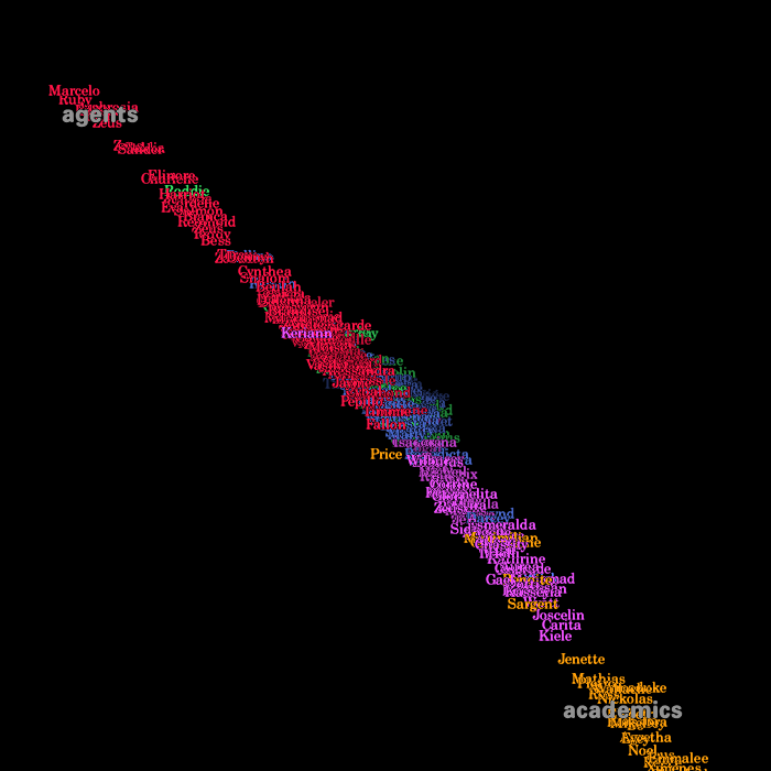
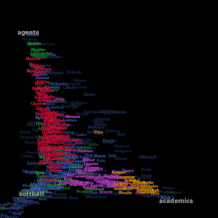
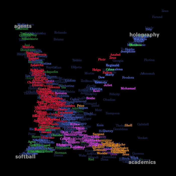
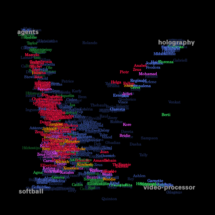
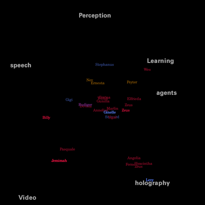
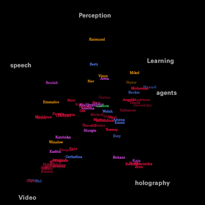
The images below show the process of creating a view of the community. In this representation the faculty members are yellow; staff is purple; graduate students are red; undergraduates are green and everyone else is blue. These images show the whole community. The brightness of a name shows the strength of the person's attachmetn to the given anchor groups.All names have been changed to protect the privacy of the community.
- A single anchor - in this case a research group - has been added. With only one anchor, nearly all the names would eventually end up gathered in that corner.
- An anchor representing the Lab's committee on academics has been added. Note how this anchor has pulled first the faculty members, followed by the staff.
- The softball team is added.
- The holography research group is added.
- the academic committee has been removed from the lower right corner and replaced with another research group, this one for building an advanced video processor board.
Visual Who can also display an animation of activity over a long period of time by using recorded data. This highlights the correlations between activity patterns and group affiliations. The area near an administrative anchor will be nearly deserted at night; graduate researchers leave themselves logged in indefinitely; an upcoming deadline will show a particular research group keeping especially long hours.
Here we see only those people who are actually logged in. The brightness of a name shows activity - the darkest names have been idle the longest. day.
- Late at night (4 a.m.) Very few people are logged in and only a couple are active.
- Midday (1 p.m.) Well over a hundred people logged in, much activity.
The list profile
Each list has a profile, showing the typical
distribution of its members' choices of mailing lists. When a list is
chosen as one of the anchors, the similarity between every person in
the community and the list's profile is computed. This is used to set
the spring constant of the spring connecting the person to the
anchor.
Building the profile
The profile of a list is built from the membership patterns of its
subscribers. If there are a total of n lists, then the profile of list
i is described by a vector  which has n entries, one
for every list. The profile vector of an list is:
which has n entries, one
for every list. The profile vector of an list is:
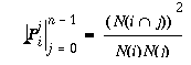
 is the number of people who subscribe to both list i and list
j, 0 < = i, j < n.
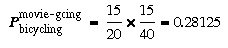
is the number of people who subscribe to both list i and list
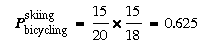
j, 0 < = i, j < n.For example, say we are creating the profile of a bicycling list with 20 members. If 15 of them are also on a skiing list which has 18 members, then the value of the skiing entry in the bicycling profile vector is calculated as:
Placing an anchor
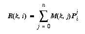
When the viewer places a mailing list on the screen as an anchor, the
program calculates each person's resemblance to that list's
profile. The calculation is simple. Since the profile of a list is a
vector with a value for every list, the strength of a person's
resemblance to the list is the sum of the values given in the profile
for each list of which he or she is a member. If M(k,i) is a membership
function that returns 1 if person k is a member of list i and 0
otherwise, then the strength of person k's resemblance to the profile
of list i is:

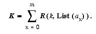
The spring system
The core of the visualization is a numerical
simulation of a system of springs. Each name has springs attaching it
to all the anchors with the spring constants determined by R. The
spring forces are the main forces acting on each name. There is also
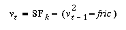
friction, so that the system will stabilize.
A list has a location when it is chosen to be one of the anchors; this
location is determined by the user. A person's location is determined
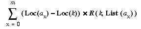
by the forces acting upon it. Loc(obj)is an object's location in the Visual
Who space.  is a function that returns the mailing list that anchor
  represents. In a composition with m anchors the spring forces
  pulling on person k in a given location are:
Program speed and the function of time
Running Visual Who as a step-by-step numerical animation is slow. It
cannot be speeded up by increasing the time-step, for that introduces
serious errors in the simulation. For use with larger databases (or
slower computers) we have implemented a simplified analytical
model.
The first step is to simplify the model. We replace the multiple forces (the springs) acting on each object with a single force - the sum of the original forces. The strength K of the new force is thus
 is the spot where an object acted upon by the given forces would
eventually come to rest.
is the spot where an object acted upon by the given forces would
eventually come to rest.
 is the initial position of the object.
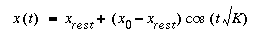
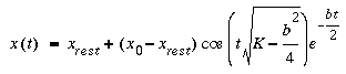
Given  we could simply place each object at its final destination
whenever the anchors are modified. However, we do not wish to lose the
dynamic motion that made the visualization so compelling: what we
really want is to describe the activity in terms of x(t):
we could simply place each object at its final destination
whenever the anchors are modified. However, we do not wish to lose the
dynamic motion that made the visualization so compelling: what we
really want is to describe the activity in terms of x(t):
Data graphics should draw the viewer's attention to the sense and substance of the data.It is notoriously easy to create an authoritative looking graph from subjective or otherwise inexact data. One of the most important design principles in creating a visualization is to use graphics and techniques that are well suited to the "sense and substance" of the data.- Edward Tufte
Dynamic Visualization
A single static image that purports to show the social structure of a
community is misleading, for this structure does not have an absolute
shape. Its contours are subjective, mutable, and complex.
Visual Who does not create a definitive view of the community; instead, it provides the means for the user to explore the information space. Each arrangement of anchors as a sketch, an impression, of the community. One gains a full picture of the community by looking at many such sketches, for each rearrangement reveals different patterns and alignment, filling in a little more of the picture of the whole community.
An important goal of this project has been to encourage such exploration. Thus, it was designed to make it easy to move the anchors about, to clear them all and start over with a new set. The term dynamic query is used to describe systems, such as this one, that provide a rapid re-rendering of interactive queries. Schneiderman's experiments show that people both enjoy using such systems and learn a great deal about the data they are exploring [24].
Information via Motion
In Visual Who the motion of the names conveys information about the
underlying database structure. When a new anchor is added, the names
most closely associated with its list are quick to stream towards it,
followed more slowly by those with weak ties, or with very close ties
to other anchors. Simply shifting an anchor's position stirs up the
names that are most closely aligned with it.
Motion grabs attention. In a visual crowded environment, the moving objects stand out clearly from the rest. Perceptually, motion is one of the "pop-out" phenomena: it is perceived very quickly by low-level visual processes[17]. In a complex scene, one is able to focus on just those objects moving in the same direction - this is the cognitive ability that allows us to detect a predator moving behind a cover of rustling leaves[21]. Visual Who uses motion to draw the viewer's attention to data that is affected by a change in the anchor arrangement. While in motion, the moving names form a coherent group, though they may settle in widely scattered areas.
Public space and privacy
New technologies, including data visualization and the monitoring of
online behavior, raise significant concerns about the erosion of
privacy. Many of these issues revolve around the ownership of personal
information: who should have access to information about one's
behavior? An application such as Visual Who, with its ability to
highlight patterns within a community, could be a marketeer's
dream.
Yet making all data private is not a good solution: public space is important to community. There are very few peons to the paranoid suburbs, where no one knows a neighbor's name and the shades of every house are drawn. The goal is to strike a balance, to have a clearly defined public space where one assumes that actions are visible.
Public space, in the virtual world, is public data. Public, however, does not necessarily mean the entire world. A better phrase is communal data: information that individuals knowingly contribute to create their community's public space. Visual Who is created with communal data; it is designed to be a tool for the use of the community. It is neither inherently privacy enhancing or destroying: this depends upon the circumstances of its use.
The establishment of a clearly demarcated public space can enhance privacy by increasing people's knowledge of what information is private and what is known to all. In the physical world, one knows that one's actions on the street are public and one believes one's actions at home are private - and adjusts behavior accordingly. Technologies that make these distinctions clear and intuitive in the virtual world make public space more vital and private space more secure.
Conclusion and future work
Kevin Lynch, in his pioneering book, The
Image of the City, wrote: The city is a construction in space, but one
of vast scale, a thing perceived only in the course of long spans of
time. City design is therefore a temporal art, but... on different
occasions and for different people, the sequences are reversed,
interrupted, abandoned, cut across.
The role of the designer is not to make a single, perfect path, but to create a space that, in Lynch's words, is "legible", one that is easily organizable into a coherent pattern. The image of the city - or of a community - is not single frame, but a series of impressions, an image in the round built from a series of successive views.
A community is not only complex, but ever changing. New people join, others leave. They are in motion, their activities changing from moment to moment. The topics of interest - the ideas that hold the community together - are always evolving.
The goal in building Visual Who was to find ways of making a community's complex and shifting patterns perceivable and legible. The solution is an image in motion: one that quickly shifts to adapt to the viewer's changing concerns; one that reveals information through motion; one that displays the ongoing changes in the community's life. It is, of course, only one among many potential images of the electronic city. There is other data to show, other ways to show it. The alias file and the utmp file are interim data sources, artifacts of Unix and of centralized computing. How does one show a distributed electronic community? What are its definitions of member or presence? People in Visual Who appear as simply their names. Would pictures be clearer or more informative? What would Visual Who sound like?
The next stage in this work is to accommodate larger populations. The implementation at the Media Lab pushes the limit of legibility with approximately 700 community members. We are exploring methods - from color manipulation to 3-dimensional data navigation[10] - for focusing on specific portions of the population. We are also working on visualizing different types of social environments, such as the interlinked home pages of the World Wide Web[7].
** Video's strength is in transmitting facial expression and gesture. For an analysis of what video adds to person-to-person communication see [13] and [16]. Here, however, we are concerned with conveying the social patterns of a community.
*** These are public files found on Unix and related systems. A mailing list (alias) consists of the name of the list followed by a list of subscribers - people who are to receive a copy of any message sent to that list. The utmp file tells who is currently logged in, when they logged in, how long they have been idle, and other such information.
Though we discuss Visual Who in the context of the Media Lab, the same data can be is found in many laboratories and corporations. Visual Who works in any such system: there is nothing Media Lab specific in it.
This work was supported by the Television of Tomorrow Research Program at the MIT Media Lab.
[2] Beshers, C. & Feiner, S. 1993. Auto-visual: Rule-based design of interactive multivariate visualizations.IEEE Computer Graphics & Applications. July, 43-49.
[3] Bly, S.A., Harrion, S.R, & Irwin, S. Media Spaces: Video, Audio, and Computing. 1993. Communications of the ACM. Vol. 36, No. 1, pp. 28-47.
[4] Buja. A, McDonald, J.A., Michalak, J., Stuetzle, W. 1991 Interactive data visualization using focusing and linking. 156-163.
[5] Davis, F. 1992. Fashion, Culture and Identity. Chicago: University of Chicago Press.
[6] Donath, J. 1994a. Casual collaboration. In Proceedings of the International Conference on Multimedia Computing and Systems. California: IEEE Computer Society Press.
[7] Donath, J. 1994b. The sociable web. In Proceedings of the 2nd International World Wide Web Conference, Chicago, IL.
[8] Dourish, P. and Bly, S. 1992. Portholes: Supporting Awareness in a Distributed Work Group. In Proceedings of ACM Conference on Human Factors in Computer Systems, CHI `92, Monterey, CA.
[9] Driver, J. & Baylis, G.C. 1989. Movement and visual attention: The spotlight metaphor breaks down. J. Exp. Psychol - Human Perception and Performance, 15(3), 448-456.
[10] Drucker, S.M. 1994. Intelligent camera control for graphical environments. Ph.D. thesis, MIT Media Laboratory.
[11] Eick, S.G. and Will, G.J. 1993. Navigating large networks with hierarchies. In Proceedings of the IEEE Conference on Visualization. Los Alamitos, CA.
[12] Fish, R.S., Kraut, R.E. and Chalfonte, B.L. 1990. The VideoWindows system in informal communications. In Proceedings of the Conference on Computer-Supported Cooperative Work, Los Angeles, CA.
[13] Fish, R.S., Kraut, R.E., Root, RW., & Rice, R.E. 1992. Evaluating video as a technology for informal communication. In Proceedings of CHI `92, Conference on Human Factors in Computer Systems. Monterey, CA.
[14] Gershenfeld, N. 1994. Modeling Nature. Unpublished manuscript.
[15] Hollan, J. and Stornetta, S. 1992. Beyond being there. In Proceedings of CHI `92 Conference of Human Factors in Computer Systems. Monterey, CA.
[16] Isaacs, E.A. and Tang, J.C. 1994. What video can and cannot do for collaboration: a case study. Multimedia Systems 2, 63-73.
[17] Ivry, R.B. & Cohen, A. 1990. Dissociation of short- and long-range apparent motion in visual search. Journal of Experimental Psychology: Human Perception and Performance 16(2), 317-331.
[18] Keim, D.A. and Kriegel, H-P. 1994. Database exploration using multidimensional visualization.IEEE Computer Graphics and Applications, Sept. 40-49.
[19] La Gory, M. and Pipkin, J. 1981. Urban Social Space. California: Wadsworth, Inc.
[20] Lynch, K. 1960. The Image of the City. Cambridge, MA: The M.I.T. Press.
[21] McLeod, P., Driver, J., Dienes, Z. & Crisp, 1991. J. Filtering by movement in visual search. Journal of Experimental Psychology: Human Perception and Performance 17(1) 55-64.
[22] Rennison, E. 1994. Galaxies of News: An Approach to Visualizing and Understanding Expansive News Landscapes. Proceedings of UIST 94, Marina Del Ray, CA.
[23] Resnick, R. & Halliday, D. 1977. Physics, Part 1. 3rd Ed. New York: John Wiley & Sons.
[24] Robertson, G.G., Mackinlay, J.D. and Card, S.K. 1991. Cone Trees: animated 3D visualizations of hierarchical information. ACM CHI `91 Conference on Human Factors in Computing Systems.
[25] Shneiderman, Ben. 1994. Dynamic queries for visual information seeking. University of Maryland Tech Report CS-TR-3022 [26] Simmel, G. 1971. On Individuality and Social Forms. (D. Levine, ed). Chicago: The University of Chicago Press.
[27] Sproull, L. & Kiesler, S. 1991. Connections: New Ways of Working in the Networked Organization. Cambridge: MIT Press.
[28] Sproull, L. & Faraj, S. 1993. Atheism, sex, and databases: the net as a social technology. Forthcoming in (B. Kahin and J. Keller, eds.) Public Access to the Internet. Prentice-Hall.
[29] Therrien, C. 1989. Decision-making and estimation.New York: John Wiley and Sons.
[30] Tufte, E. R. 1983. The Visual Display of Quantitative Information. Cheshire, CT: Graphics Press.
[31] Tufte, E. R. 1990. Envisioning Information. Cheshire, CT: Graphics Press.
[32] Whyte, W. 1988. City: Rediscovering the Center. New York: Doubleday.